Wool Online
by LloydCreative • Uploaded: Apr. 21 '09 - Gallerized: Apr. '09
Description:
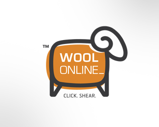
Logo for company that deals in the sale of bulk lots of unprocessed wool. The slightly retro monitor shape doing triple duty as the sheep's body and a stylised wool bale while still being a computer screen.
Status:
Nothing set
Viewed:
23429
Share:

Lets Discuss
If it's for the web, I vote for this one (other 2 are maybe too complex for that)...
ReplyThanks Alen - this was a fave of mine, but ultimately not selected by the client.
ReplyTHIS ONE
Replyi like this one, its real good
ReplyI agree. This one. It is the most memorable in my opinion. Nice job!
ReplyNicely done, I can see this working well for branding.
ReplyAppreciate all the comments and you all taking the time to look in... means a lot coming from a talented group such as yourselves.
ReplyBueno!
ReplyI like where the TM forms the tale of the sheep :p great logo
ReplyThanks Mike and T%F8mme - appreciate the floats and comments.
ReplyBig Al! I love this logo, really really nice colour selection also. The only think that would concern me is the byline being to small for an online based logo, other than that great looking logo. Just a pity the client didn't see it's potential.
ReplyExcellent! Very envious of your outcome. My logos tend to be a little forced... this is spot on.
ReplyThanks Chris, Gold Coaster %26 Stefanie for looking in - and for your very kind words.
ReplyI would like to buy this logo for another project, why don't you email me to discuss.
ReplyI love the logo. To be super literal seems almost like a logo for sheep tv. But really a great display of creativity. Eye-cathing and memorable. Would also work well even without the colored background for traditional print pieces*. Nice work.
Replylove Great site. This could probably have the refactoring tag added t it. http://www.fashion-jewellery-shop.com/*
ReplyPlease login/signup to make a comment, registration is easy