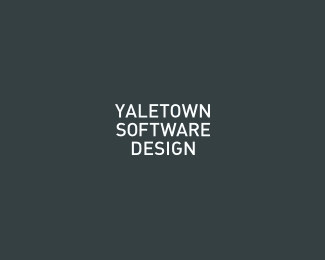
Yaletown Software Design
by epsilon • Uploaded: Apr. 12 '09

Float
(Floaters:
3 )
Description:
WiP for a small software company.
As seen on:
www.yaletownsoftwaredesign.com
Status:
Unused proposal
Viewed:
3147
Share:


Lets Discuss
Thoughts / impressions ? Is there anything similar out there ?
ReplyMy first impression. Is this for a typography blog? I had to really look at it for a second to read it. How would this work in monotone? and lastly but most importantly it says nothing about software design IMO.
ReplyI really like the clean typography, but initially my peepers read it as YALETOWNS OF TWARE DESIGN. I think the 's' next to the 'town' is causing a problem imo. Maybe a stronger colour contrast could be the remedy.
ReplyMike, typography blog .. hehe, good one.The monotone version if it will ever be required will use different type weights instead of colors. WRT not saying anything about the design - true, but the purpose of this specific logo to make it memorable by being quirky rather by having conceptual reference. E.g. would you recognize the logo the second time you see it ? Probably, right ?**Neil, initially - yes, towns of tware, that's expected. But you did manage to read it correctly with a bit of an effort, didn't you ? I am still playing with kerning and contrast though.
ReplyAll cool Epsilon, I guess it's more important of how your clients perceive it and who their target audience perceives it. Sometimes as designers we tend to put ourselves in this 'creative' mode and forget about selling to the client or the clients audience. Step back look at this at a different perspective. yes I like how your being creative and all but just not feeling sold.
ReplyThanks for the comment, Mike.**Updated with even loser kerning between the words.
ReplyIf anyone cares, %22here%22:http://typophile.com/node/56751 is a typophile thread featuring the %22unreadable collapse of words%22 opinion and then some :-)
ReplyThanks, Dalius. It's a great logo indeed. I actually remember reading about its design process and it was IIRC a bit of a struggle for them as well :)**In my case the branding of the company is secondary to the branding of their products. At least at this point. It just needs to be something bold and unique, we-are-not-like-others kind of thing.
ReplyPlease login/signup to make a comment, registration is easy