Personal Mark
by iconify • Uploaded: Dec. 26 '06

Float
(Floaters:
17 )
Description:
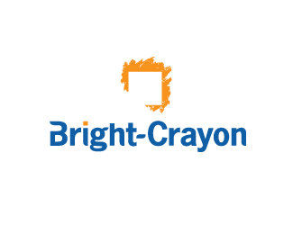
I have toyed with using this variation of the Catalyst Workflow Solutions* logo for my logo design business for a while now. I decided to go ahead and take the plunge because I want a logo that communicates my illustration style.
The logo re-design cooincides with a complete re-design of my website as well.
* Catalyst Workflow Solutions was my former business that merged with Bright-Crayon, LLC in January, 2006.
As seen on:
iconify.it
Status:
Nothing set
Viewed:
21976
Share:

Lets Discuss
I quite like the negative to a positive approach!
Replynice work
ReplyI love the burst.. kudos
Replya trully copy*http://www.lml.me.uk/**shame you
ReplyIt's pretty obvious that LML ripped it off from this. You can tell because the type he uses is sharp, yet the mark is blurry. Why would his mark be blurry if he did it himself?
ReplyYep, LML logo is clearly a rip of this one. %22Shame them%22.
Reply%5ENew mark Alex?
ReplyHoly Smokes! I have not been on Logopond in quite some time and hadn't seen the blatant plagiarism of my logo design. Everyone who defended me and said it was clearly a rip-off of my work is correct.**@carpeguiga - My work speaks for itself. I have never plagiarized another artist's work. And shame on you for speaking when you don't know the facts.**This company will be getting a call from me pronto.
ReplyI wrote to the company that plagiarized this logo but got no response. Now I have to decide whether or not I want to go through the cost and hassle of taking legal action. There is no question that I will win but there is the question of how much it will cost. Does anyone have experience in this area and doesn't mind sharing some insight?
Reply%5EI have been ripped off several times also, but have never taken legal action. I would love to hear what some of the experienced designers have done in this situation...
Reply@lewiscot Very nice logo.*I need a logo like this. May I use this logo or can you design a new logo like this? I am trying to reach you. selmanerkan@gmail.com
Reply@selmanerkan, I apologize for being so slow to respond. I'm no longer doing logo design full time so I don't frequent this site much these days due to limited time. Please contact me at me@scottlewis.info and we can discuss the logo. I may be able to design something new but until the issue with this logo plagiarism is resolved, I don't think it would be wise for me to sell this one.**For anyone who is interested, I have posted an update on this issue on my blog: http://iconify.it/design-in-the-wild/sincerest-form-of-thievery/**I am currently looking into taking legal action against the company. They have ignored my attempts to contact them so I think a law suit is the next step.
ReplyNO Comment, ...the guy is really good designer when he managed to scratch out an original symbol of another designer.
Replyhttp://blog.iconfinder.com/interview-with-scott-lewis/
Tony, you do realize this is the same person right...
ReplyYes, I am the same guy. Scott Lewis a.k.a. Iconify. About 10 years ago I was a logo designer but switched over to computer programming but I still run a stock & custom icon business on the site at http://iconify.it
ReplyI blog about icons for Iconfinder.com as well as sell my work on several icon marketplaces.
It's not that difficult to verify my identity via social media and many of the icon marketplaces like iconfinder, The Noun Project, CreativeMarket, Dribbble, Twitter, Behance, or Facebook.
Please login/signup to make a comment, registration is easy