Capital
by Logomotive • Uploaded: Apr. 05 '09
Description:
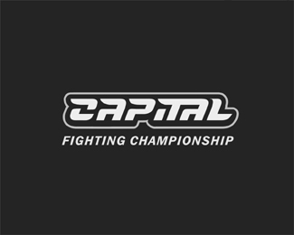
Logo mark created for MMA (Mixed Martial Arts) Promoters. Custom type.
Status:
Nothing set
Viewed:
2910
Share:


Lets Discuss
Thanks Dalius. The clients like it and thought that the C can be used separate as the mark. The C has that yen yang often associated with Martial Arts. I also see the C to kind of look like a fist punching.
ReplyVery nice type solution.
ReplyWow yeah ditto what he said %5E :)
ReplyThanks Glen and Jess %3B-)
Replyi think it's awesome, immediately thought of UFC
Reply%5ECompetitors baby, thanks that's the style that drives the market.Thanks george.
ReplyI like it a lot too!
ReplyNice typography as expected
ReplyThanks Porter Design and CP:-)
Replywhat up mikey, with out a doubt this is fantastic.. The second A however is bothering me, it almost combined with the T reminds me of a lowercase a.. Still a great type!
ReplyThanks Steve, yeah but that's because of the negative areas. I wanted to keep all the negative area the same so it is less distracting. At least it acts as an a (A) not matter how you read it.
ReplyThe design has been in use since July of 09 and doing well but this is all I could gather so far. http://www.combatlifestyle.com/pics/view_image.php?id%3D78162
ReplyPlease login/signup to make a comment, registration is easy