Home
Gallery
Activity
Creatives
Sign In / Register
Featured
Beauty Spa Salon Logo
Proffalices
Float
Spartan Technology
Costoboc
Float
White Eagle Logo - A Symbol of Strength and Vision
Dainogo
Float
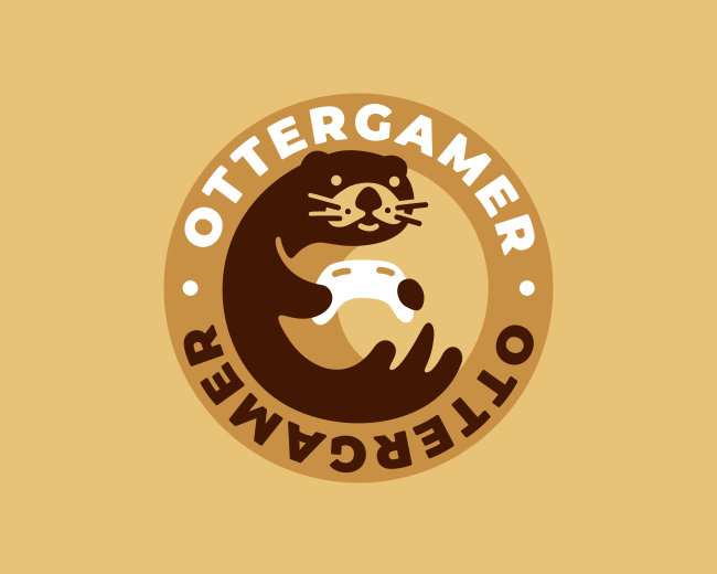
Otter Gamer Logo
Nagual
Float
Free Bird
Costoboc
Float
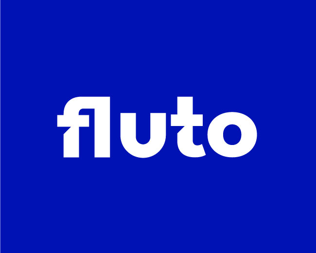
Fulto Logo - Fintech Company Logo
Rakibul62
Float
Child Health Nurse Logo
Proffalices
Float
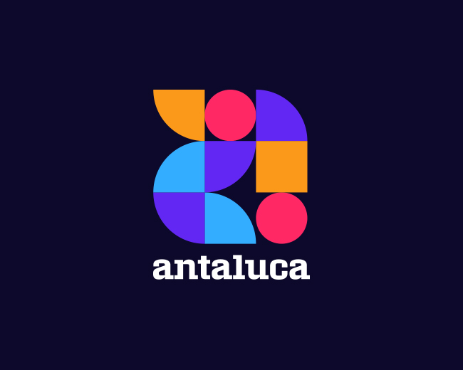
Razvan Antaluca Visual Identity Design
Cajva
Float
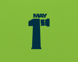
May 1st
Ambi
Float
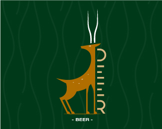
Deer Beer
Ambi
Float
Bear Laundry Cleaning Logo
Proffalices
Float
Cute Tailor Mascot Logo
Proffalices
Float
Brain, Infinity, Chat, AI Logo
Artology
Float
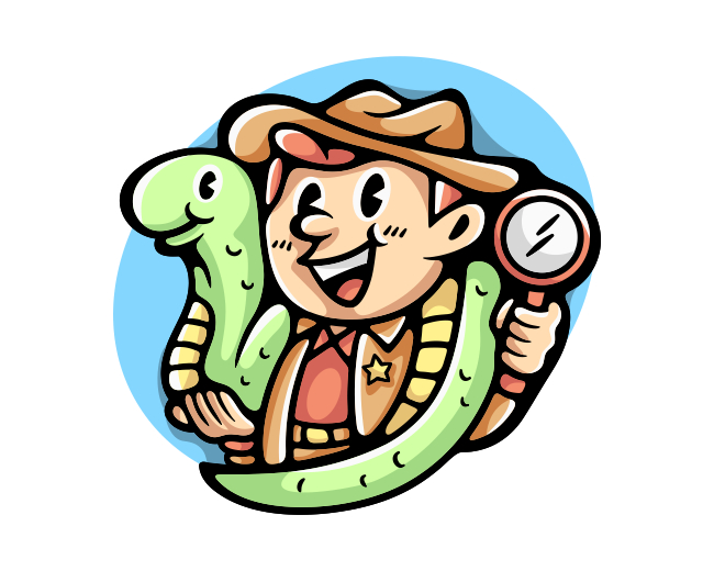
Snake Charmer Hunter Logo
Proffalices
Float
Ink Screen Printing Logo
Proffalices
Float
More
Featured Artist: mikylangela
Follow
mikylangela
Logos :
110
Lock secure
Mikylangela
Float
Window
Mikylangela
Float
House2
Mikylangela
Float
House
Mikylangela
Float
Fox
Mikylangela
Float
Spyskey
Mikylangela
Float
Stairs
Mikylangela
Float
tree
Mikylangela
Float
T
Mikylangela
Float
AI
Mikylangela
Float
AI
Mikylangela
Float
Dolphin Dental
Mikylangela
Float
OlgaZimm
Mikylangela
Float
Kokkoresort
Mikylangela
Float
13 Head
Mikylangela
Float
Geoloop
Mikylangela
Float
N Lettermark
Mikylangela
Float
Umbrella
Mikylangela
Float
Football Love
Mikylangela
Float
Dental Elephant
Mikylangela
Float
Recent Discussions
Oboy1999
Great logo!!
https://tiny-fishing.com/battleship-online
TytaPyta
Curiosity about hormone therapy led me to do some online digging, where I found a goldmine of information[...]
TytaPyta
Curiosity about hormone therapy led me to do some online digging, where I found a goldmine of information[...]
Mjaysmonk
I love this!
rogertunes15943
I liked this logo design for a poker coin. It is a kind of striking and might be[...]
tickey
Pleasent designs.
More
Creatives
Type08
Follow
487 Identities
Following 118
661 Followers
Follow
proffartline
Logos :
338
Follow
Proffalices
Logos :
374
Follow
logoman
Logos :
206
Follow
Rakibul62
Logos :
178
Follow
Logomika
Logos :
131
Follow
Cope
Logos :
175
Follow
LPAdmin
Logos :
20
Follow
costoboc
Logos :
416
Follow
Luigi1818
Logos :
54
Follow
morecolor
Logos :
54
Follow
LarLap
Logos :
127
Follow
ImonUix
Logos :
82
More
Logopond © 2006 - 2024
Contact: Management
|
Terms of Service
|
Privacy Policy
|
Advertise


Great logo!! https://tiny-fishing.com/battleship-online