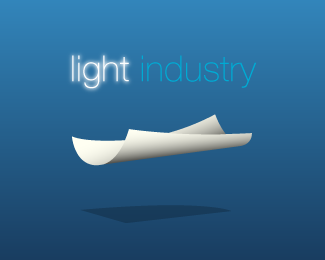
advertisment

Light Industry v5

by Bernard Kowalski • Uploaded: Dec. 19 '06
Gallerized Dec. '07 0d537544dfe1058aff39ba23f11c5d16.png
8303

Description: Yet another idea for Light Industry. I don\'t think I\'m done with this one yet, but I\'d like feedback.

Status: Nothing set

Commenting: Not seeking critique, comments fine

More from this user:

SpiffyJ said on Dec. 19 '06

If you want feedback you should mark this post with the "green flag." I think the eye doesn't move around this logo very well. Very nice idea but the arrangement of the bugs doesn't work in that location. On a totally different idea...Can you make letter shapes that are cut out of the leaf and the bugs can be carrying 2 letters away?

Bernard Kowalski said on Dec. 19 '06

Nice, I will try that. Thanks Yeah I forgot to flag this one, thanks for the note.

mota said on Dec. 22 '06

Nice, I also will try that. Thanks

mota said on Dec. 22 '06

just_jeepin said on Dec. 22 '06

What about bringing the text down and having the ants walking on top? Just an idea.

waterelement said on Dec. 22 '06

this is awesome! i think it would be more pleasing to the eye if you eliminate more of the white space in between ants, logo and text somehow. good job!

derok7 said on Dec. 22 '06

Just tighten it up and play with the arrangement and it should look great!

nead said on Dec. 22 '06

Hmmm. How about just one ant and one leaf? This may simplify things a bit. And tip the leaf like the second ants. Great colors - don't overdue the reflection thing... lot's of folks are using this effect these days... Cool idea no doubt!

Helios said on Jan. 02 '07

I like this better than the other light industry versions. There's something very cute about this. How about stripping the logo down to the typography (above), and using the ants theme extensively as part of the business card/brochure/web design? eg. see http://www.templatemonster.com/flash-templates/13128.html

kesio said on Nov. 07 '07

i really like it... just the way it is right now!

firebrand said on Dec. 02 '07

I bagged this one in my favs a while ago... it makes me smile.

paulj said on Dec. 03 '07

hrmmm. my only question is are the pieces of leaf really 'light' to the ants? as they look like they're having a hard time with the pieces. Maybe I'm off, but I'm just not getting a solid enough connection between the client name and the symbols...

zero6 said on Dec. 06 '07

I really like the concept and the "industry"-font is really great - but maybe its just a bit too bold, compared to the light one... Nice work!

cmortensen said on Jan. 07 '08

Overall...love it! I agree with nead and think that one ant and leaf would simplify this and perhaps help with the movement issue Spiffy J mentions. The thing I'd like to call out is the symbol to text ratio. The text is too small compared to the leaf/ant GFX. If you were to scale this down you'd loose the legibility of "light".

Please login/register to make a comment, registration is easy,

Logopond Book V1 - PreSale Now!