Circle Productions
by misterjones • Uploaded: Mar. 23 '09

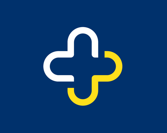
Float
(Floaters:
19 )
Description:
WIP, playing with opposites to emphasize the nonconformist nature of the company.
Status:
For sale
Viewed:
3,392
Share:
Lets Discuss
Hahaaaa, this is extremely amusing! :)
ReplyWow, really cool.
ReplyNice clean type.*Chanel No 5?
Replyyea a very good lateral approach, great job
ReplyIt is nice and clean, but it does have a strong Chanel 5 feel to it.
ReplySorry Mr. J, but this idea is done before for the (well known) %22bluecircle%22:http://www.bluecircle.tv/index.php *http://www.bluecircle.tv/upload/logo.gif **
Reply@muamer. oops, haven't heard of them, but also didn't expect to be the first one ever to think of this. O well, back to the drawing board. Might name the company square and...
ReplyYes, (square and then... lol :) Great minds think alike, but your realization is much better...
ReplyI was actually inspired by Stefan Sagmeister's branding for Blue (jeans stores in Austria), where he only used orange and black. Blue Circle takes it even further by using a magenta square, but i'm not too fond of the layout and typography of their logo. Anyway, thanks for the nice comments everyone, and agreed on the Chanel nr 5 similarity, it's the white box and the typo. Not intentional but quite obvious now.. o well, it was fun while it lasted :)
ReplyMaybe you could still use that same thinking, by using a triangle or something.
ReplyI always liked this kind of 'jokes', even thinking about one. The bluecircle goes full way in the 'joking' theme. But i like both concepts, them and yours.
ReplyPlease login/signup to make a comment, registration is easy