nocturn
by tass • Uploaded: Mar. 20 '09

Float
(Floaters:
8 )
Description:
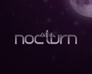
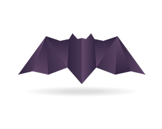
Logo design for my design studio. A bat in an origami approach. www.designbynocturn.com
As seen on:
www.alextass.com
Status:
Client work
Viewed:
7005
Share:


Lets Discuss
Nocturn, Because you lost the bat. The font is nice and the mark is sweet. IMO you are working to hard to make this one entity. The fix: simplify - center bat above nocturn and you keep the essence of the mark everyone loves and the readability of nocturn. That was easy - challenge me. :P
ReplyWell i was thinking about that at my first sketches, but i didn't like the result from what i remember, maybe i'll give it a second try, thanks for your advice Ashley!
ReplyYeah...I agree with muse7...you should give it another try...**You have a very piece of typography there! Really like it, and the bat is so cool...**Try to put de Bat above the typography and match the sizes...IMO that will get it done.
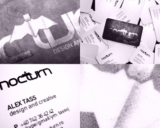
ReplyUPDATED: Added images showing reversed version, the symbol, and a few details of my business cards.
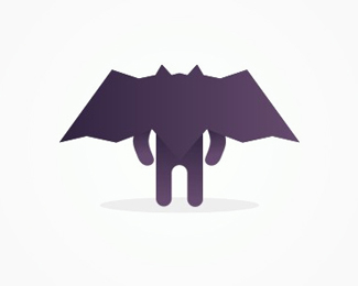
ReplyUPDATED: Added the bat / nocturn / personal character based on logo symbol.
ReplyPlease login/signup to make a comment, registration is easy