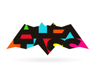
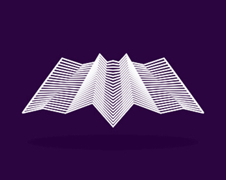
Nocturn / Alex Tass bat logo design symbol
by tass • Uploaded: Mar. 20 '09 - Gallerized: Dec. '15

Float
(Floaters:
139 )
Description:
Part of my Nocturn logo design, I am using now this bat as a symbol / full logo for my portfolio website www.alextass.com and as my personal branding.
As seen on:
www.alextass.com
Status:
Client work
Viewed:
25579
Share:

Lets Discuss
i like it!)
Replysame here %3B)
Replythank you guys!
ReplyYou're kind of too close to batman.
Replybeside the fact that we both have bats in the logo, and that i like the batman concept i think these are still 2 different concepts. and as i said in the description this is only the symbol the full version of the logo is also in my profile. thanks for your opinion anyway.
Replyi like the lights/shadows balance.%0D*we expect more logos from you! :)
Replythank you, on their way :)
Replywell %22this%22:http://logopond.com/logos/4c6ac7f345c35b0d9ba97081bce93c9a.png (including name) is what you are talking about. i have tried the name under the symbol as separate items byt it didn't look so cool to me. thank you for the comment.
ReplyHow great is that! :)
Replyinteresting bat!
ReplyThank you! :)
Replywow, it%B4s so hard to do polygonic symbols with only 10? faces. Great job.
ReplyI want this powder-coated up on the wall...! Nice one.
ReplyThank you both mukomio, michaelspitz!
ReplyThis is hot
Replyi would like to see this as a cool business card that folds into a bat :P
Reply30st float, time this little bugger got featured!
Reply31, How many floats does it take to get to the big pond (Gallery)?
ReplyThank you all, i am overwhelmed by your comments :)
Replytass, it always stands out to me so it's memorable. Just need that big D approval and without type maybe not?
ReplyLet's start a petition! %3B)
Replythis will be on the front page soon.. great work here.
Replywell, %22this is the version with both symbol and type%22:http://logopond.com/gallery/detail/57312 that i use for now, but it hadn't gather so many interest as the symbol itself/alone, so i guess that keeps it away from the pond's gallery. *thank you all again for the compliments and kind words.
ReplyLooks very nice, tass. Impressive.
Replyi like this too tass
ReplyThanks Alex! good to see you here %3B)
Replyand a great logo too %3B)
ReplyYou have a great eye for details, great logo.
Replythat's brand is amazing!!!
ReplyThank you everybody!
ReplyLove the overall simplicity combined with the subtle shading.
Replyreally like the idea of origami style and the simplicity of the mark, great concept :)
Replyme likey, me likey lots. I enjoy the simplicity with the polygons and gradients. It's a floater
Replynice :)) acum am realizat k nu tiam votat liliacul
Reply:)) (tare asta) Moaaaa pai cum l-ai ratat?!? :P
ReplyPS. Thank you all for comments and floats!
ReplyHey Alex, just saw your work on Abduzeedo... awesome man!
ReplyThank you Floris, really appreciate!
ReplyThanks Alessandro. Well i was hoping that in the other formats is still recognizable as a bat, but, at least is a good thing that awakes your curiosity in seeing more. :)
Replylovely!
Replyvery nice logo, which got a really nice website, thx for the comments, compatriot!%3B)
ReplyThanks guys :)!
ReplyWhat...I never floated this..? Fixed... %3B)
ReplyThanks buddy! :)
ReplyNice work Alex!
ReplySchweet illustration!
ReplyThanks guys! :)
ReplyThis is great!
ReplyThank you David!
ReplyThis is sooooooo Nice!**Great work!
ReplyHey Tass love it, as all your work, so awesome and so much, you are great!!
ReplyThanks a lot for your comments Luis!
ReplyBatman would approve! And so do I :)
ReplyI hope so. :)
Replyawesome mark.. Tass..
Reply%5EYep, thought I floated a long time ago. Nice Tass.
ReplyThank you both! :)
Replytass ... thanks for the bunch of floats .... really appreciate that !!
ReplyWell i really like all of them and i also want to thank you for all your lately support! Really appreciated!
Replywoohooo. the dark knight.
Reply:))) yes, something like that
Replythis is pretty good work!!! great!!!!!!!!
ReplyI love the shades on the wings :)
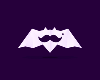
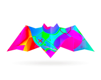
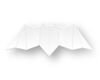
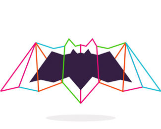
ReplyUPDATED: I have created many variations for it in order to have a more dynamic webpage, on each page and on each visit one of them being showed randomly. I have added images for 6 of the created variations. More available on the website. :)
ReplyI love all the great work you're doing.!
ReplyThank you @yuro the feeling is mutual!
ReplyCool bat!!!
ReplyYour version of your logo is great tass, love all the variations too!
ReplyThank you @Flash-maN :D
ReplyThank you @Shalamanoff I am happy to hear it. I did so many variations haha, and still mre to come! :D
ReplyThank you so very much @logopond for the feature, means a lot to me, love you guys! :D
ReplyThank you @Shalamanoff all the variations are mine. :)
Replyone of those, 'i could have sworn he was featured before's' congrats!!!!
Replycongrats!!
ReplyHoly overlooked, Batman! Congrats!
ReplyCongratulations, Alex! :)
ReplyI second what David said, seriously?! Congrats buddy, long overdue...
ReplyCongrats man!!
ReplyCongrats on the feature Alex! A logo machine
ReplyCongratulations!! Well deserved!
ReplyI can't believe you haven't been featured before. Congrats bro!! :D
Reply@firebrand LOL
^ what He and Pops said. Congrats!!!
ReplyCongrats man!
Replyhahah... and he took the pond overnight :) cheers big fella!
Reply@logomotive Thanks son ;)
ReplyCongrats Buddy...Welcome to the club :)
ReplyHaha, thank you so much @climaxdesigns very, very much appreciated!
Reply@secondeight thank you!
Reply@firebrand thank you so much!
@ru_ferret thank you!
@type08 much appreciated!
@vaneltia thanks man!
@designabot naaaaah, not a logo machine, a logo bat hahaha :D
Reply@mistershot thank you!
@Oronoz� I wished and waited it for so loooong, haha, thanks mate!
@logomotive thank you so much!
@-Yoon- thank you!
@logoholik of course over night! that's the best part of the day hahaha! :D
Reply@Nitish thanks man! Do I need to prepare a special hat or a special outfit, something? :D
WooHoo!
ReplyAlex who? Never heard of him.
ReplyCongrats Alex!!
Reply@THEArtistT :D
Reply@chanpion I will try to fix that in the future hahaha :D
@almosh82 thank you!
Welcome to the club dude!!
ReplyCongrats Alex! Well deserved (in fact I was surprised you weren't already featured). Always great work.
Reply@HayesImage thank you, nice to be part of it! :D
Reply@logoboom thank you, appreciated!
Please login/signup to make a comment, registration is easy