S.H. United
by 903creative • Uploaded: Mar. 15 '09

Float
(Floaters:
23 )
Description:
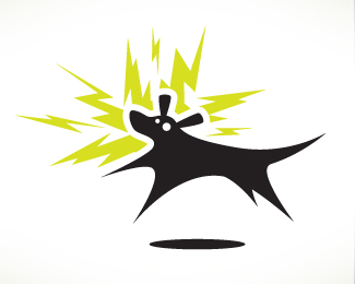
Logo for a local soccer team who wanted to play off of the name of the MLS team, DC United.
Updated: Extended the bird's head a bit more and slightly adjusted the colors.
Status:
Nothing set
Viewed:
19784
Share:
Lets Discuss
Powerful mark.***
Replyi really like your work!**The head feels a little squashed down.
ReplyI agree with Brandon and that other guy. Move the head just a little to the left and up a smidge and it would strengthen it even more. The star on the breast is a little big, but that is a personal opinion. I love it over all.
ReplyI forgot to mention that this soccer team has very low self-esteem, hence the lowered eagle head. JK. I'll give 'em a little more pride and upload a new version. Thanks for the feedback!
ReplyUpdated the head shape. Let me know what you think. Thanks!
ReplyI would still move the neck a little more to the left, but it is certainly wonderful as is.
ReplyExcellent!
Replyjust a thought, try the soccer ball instead of the star?**yes maybe no? lol
Replylooks great, i bet they feel professional with this team logo. gotta look good to play good!
ReplyThis is a good sport mark, although I'm not convinced of the star.
ReplyPlease login/signup to make a comment, registration is easy