Home
Gallery
Activity
Creatives
Sign In / Register
Featured
S
Rox
Float
Tehno polyushko
Brandcome
Float
Skate Art Club
Rhewlett
Float
Land People
Cajva
Float
BioArm
Gresus
Float
Magnetic Puzzle Co
Szende
Float
Save Haven
BeetrootGraphics
Float
Immo Unit
Kreatank
Float
FBC
Cope
Float
Sac Fit logo concepts
Szende
Float
Magnetic Puzzle Co
Szende
Float
Fishgrid
Szende
Float
Sac Fit logo concepts
Szende
Float
Power of wine
Logomika
Float
Sac Fit logo concepts
Szende
Float
More
Featured Artist: mrshamsurrahman
Follow
mrshamsurrahman
Logos :
124
Ke Logo Or Ek Logo
Mrshamsurrahman
Float
Ke Logo Or Ek Logo
Mrshamsurrahman
Float
Ke Logo Or Ek Logo
Mrshamsurrahman
Float
Ke Logo Or Ek Logo
Mrshamsurrahman
Float
Letter Ke Logo Or Ek Logo
Mrshamsurrahman
Float
JC Or CJ Real state Design
Mrshamsurrahman
Float
JC Or CJ Logo And Icon Design
Mrshamsurrahman
Float
Fire Rooster Logo
Mrshamsurrahman
Float
Fire Rooster Logo
Mrshamsurrahman
Float
Fi Or If Monogram Power Button Logo
Mrshamsurrahman
Float
Funny If Fi Logo
Mrshamsurrahman
Float
IF FI Diamond Logo
Mrshamsurrahman
Float
IF FI Logo
Mrshamsurrahman
Float
IF FI Real Estate Logo
Mrshamsurrahman
Float
IF FI Real Estate Logo
Mrshamsurrahman
Float
FI Or IF Monogram Power Button Logo
Mrshamsurrahman
Float
FI Or IF Monogram Power Button Logo
Mrshamsurrahman
Float
IF FI Logo
Mrshamsurrahman
Float
IF FI Logo
Mrshamsurrahman
Float
IF FI Love Logo
Mrshamsurrahman
Float
Recent Discussions
ozwalker
Can I purchase your logo?
MMOOHH
massage me via gmail :
moh.elsheikh01@gmail.com
so we can discuss your brief
johnhsmith
such a excellent design! But what's the game of it? Can you make another logo for some puzzle[...]
Mehmed
Harika site
canuzer
canuzer65@gmail.com
Silver Seger
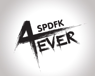
Hi can you design this with ever on top and young on the bottom?
More
Creatives
andreiu
Follow
74 Identities
Following 26
234 Followers
Follow
sleem
Logos :
79
Follow
LPAdmin
Logos :
20
Follow
szende
Logos :
96
Follow
cream5
Logos :
97
Follow
firebrand
Logos :
134
Follow
HDCestudio
Logos :
14
Follow
LogoFolder
Logos :
18
Follow
Kreatank
Logos :
438
Follow
MMOOHH
Logos :
350
Follow
Alexandar
Logos :
107
Follow
AliAljilani
Logos :
103
Follow
Miranchukova
Logos :
87
More
Logopond © 2006 - 2025
Contact: Management
|
Terms of Service
|
Privacy Policy
|
Advertise


Can I purchase your logo?