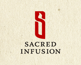
Sacred Infusion
by ryantoyota • Uploaded: Mar. 13 '09

Float
(Floaters:
0 )
Description:
A logo for a prayer ministry, where a list of international prayer concerns is distributed weekly. This version was chosen over the initial concept because it communicated better the feel of the ministry.
As seen on:
sacredinfusion.org
Status:
Client work
Viewed:
2934
Share:


Lets Discuss
I much preferred your original design, but understand the point.
ReplyI agree with Logomotive. The first version with the candle in the S was really nice. This is fine, too, but I feel the background and the double color splot behind the kneeling S is way overpowering the the mark.
ReplyYeah, making the decision to not use that original logo was one of the toughest design decisions I've ever had to make. I agree that the first design was much cooler, but this just fits better.**Thanks for the input, theartist. It's not always used over this background, so it's not always %22overpowered%22 in this way, however I actually find that the mark stands out more on a background like this that has similar colors to the burst. The burst kind of highlights the mark this way.
ReplyPlease login/signup to make a comment, registration is easy