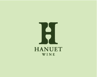
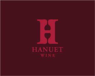
Hanuet wine 2
by eziemac • Uploaded: Mar. 12 '09

Float
(Floaters:
50 )
Description:
Another concept for a wine logo. The negative space of the 'H' features a wine bottle with the label serving as the bridge on the H.
Status:
Nothing set
Viewed:
10229
Share:


Lets Discuss
Nice...
Replyvery good
ReplySpot on. I'll drink to that! %3B)
ReplyThis version is great.
ReplySolid.
ReplyLovin' the symbol - the type needs some more work.
Replyperfect - this is better than the other
ReplyAt first I thought i saw a glass of wine thinking: %22An upside down glass is just silly.%22 and then it hit me. And now I want some wine. Great logo, I wouldn't change a thing.
Replyperfect - love it
Replythis is my favorite version so far!
Replywayy, front page!**cheers for the comments :)
ReplySo is this for a winery or a wine retailer?
ReplyUnfortunately it is just a made up brand. **A few of my latest clients havn't payed me to be creative, more to create precisely what they want so its nice to do something like this.
ReplyI can respect that :) Sweet design. If I ever open up a winery you'll be the first I call!
Replyhaha cheers buddy, also, if you're looking for a wine taster you know where i am :)
Replygenius / pure %26 simple
ReplyI like it, but I saw a plunger first, although that could be because my toilet keeps clogging...
Reply@tdf, you should get that checked out.**@ezie, nice logo
Replyvery nice,*when i first looked i thought it was a wine glass upside down.
ReplyAt first I saw an upside down wine glass, and then after reading the name, realised it was a wine bottle. You've just killed two, maybe even three birds with one stone. Kudos!!**Not sure about green as the primary colour though...
Replygreat logo my friend!
ReplyGreat. I like type logos. Very clever.
Replycheers fellas
Replyeziemac, I liked em all but have to admit I agree with TDF, this is my last fav due to the thick stem. I liked the others better. Maybe you could fix the stem, it's WAY too thick for a wine glass.
ReplyDoh, Ok The bottle duh, but the wine glasses work best IMO. I guess I had my mind set on your previous designs. this is just too hard to make out for the average consumer IMO.
ReplyI like the red one better. This one is a bit close to this:*http://www.headshot.tm.ua/
ReplyCheers for the comments.**@Mike: Yeah i understand, i think most people see an upside down wine glass at first. I like the fact that it almost serves as a puzzle or optical illusion which i suppose is fine as it will not be used as a real brand.**There may be a slightly nicer variation here http://www.eziedesigns.co.uk.**@Roy: I thought to myself that this one is better only because it reached the front page, but i suppose im free to think my previous ones are better :)**you're right about the similarities.*
ReplyNice design. Even I Thought it to be an inverted wine glass. I am still a beginner here and would love to learn a few things.
ReplyIts similar by the fact they are both 'H's with an object in the negative space. The two logos, however, have completely different objects in the negative space and also are for completely different markets. I would also like to point out that i have never seen the other logo before.**however, i respect your decision and i'm not going to dispute it.
ReplyI'm sorry eziemac, it happens to us all. A couple of ago I years came up with a similar 'H' design with a test tube in the negative space. Thankfully the client didn't go for it. This of course is more likely to happen with the simplest ideas. :)
ReplyI meant to say 'a couple of years ago'.
ReplyNo worries, Roy, its a touchy subject in logo design and i prefer for my logos to be completely original so its probably for the best :)**I hope i don't sound weird here but basically i have had your website bookmarked sinse i started out in logo design ( which was a year ago, so no need to be too flattered!!) and im a big fan of your work, keep it up. :)**cheers.
ReplyCan i join the bandwagon :) http://logopond.com/gallery/detail/40237*Now back to the topic - those two are really delivering different message, meaning and working in different fields, but unfortunately look pretty similar :)
ReplyI'd like to see the red version in the gallery but that's not my decision.
Replyhey, thanks, Houston :)
ReplyGreat mark. I prefer this one to the one done with the goblets.
ReplyThis is great Euan.
ReplyVery Creative
ReplySuper Cool!
ReplyPlease login/signup to make a comment, registration is easy