Avifauna
by downwithdesign • Uploaded: Mar. 10 '09 - Gallerized: Mar. '09
Description:
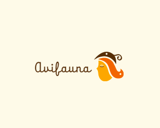
A womens fashion website. Non e-commerce. The concept is three birds making the image of a woman with styled hair wearing a fancy hat, as a representation that fashion is "human plumage".
As seen on:
Down With Design
Status:
Client work
Viewed:
15487
Share:


Lets Discuss
Very nice, Gareth. You managed to kill 3 birds with the 1 stone too. I love the type, especially the 'f'.
ReplyCheers man, It's a font though, can't take credit for the type, just the match %3B)
ReplyYeah, the perfect font choice.
ReplyBeautiful balance, Gareth!
ReplyThis is a very nice logo.*Well put together with the font choice, colors and illustration.*I can see it working well on their identity system, hang tags and shopping bag.
ReplyReally beautiful. nice colours and great illustration!
Replyvery nice gareth, love the colors
ReplyVery nice %26 stylish, Gareth!
ReplyVery nice, getting a nice 70's feel from this.
Replygreat stuff dude...i really love it :)
ReplyThank you kindly!
Replylove it whena logo is this crafty, artsy urgh beautifull
Replythe orange bird is the best one... cool logo!
ReplyVery nice, Gareth, well done
ReplySophisticated and fun at the same time. Good job!
Replycolors are really good.
ReplyNice. I like the font! Good job.
ReplyGreat balanced colors and good choice of the font. Super job gareth!
ReplyCute
Replywatta nice one! :P
ReplyCan you list the typeface please?
ReplyNot making any accusations here, but my friend has a coffee shop in Central Oregon with the same logo mark. I don't know who designed it. See it here... http://cache0.bigcartel.com/product_images/2312663/BOM-DIA-LOGO.jpg**I wonder if this is some old design that a couple people have used for their clients.
ReplyInteresting. And what do you mean %22I wonder if this is some old design that a couple people have used for their clients%22? That doesn't make sense and wouldn't explain anything. Somebody still created the design and knowing Gareth...my money is on him. Plus his design is much tighter.
ReplyWow. %0D*%0D*%22I wonder if this is some old design that a couple people have used for their clients.%22 sounds a lot like an accusation to me.%0D*%0D*This is 100%25 my own work. Does your coffee shop have a website? I would very much like to speak to them. Since I'm about 5,000 miles away from Oregon I can't exactly drop in to say hello...
ReplyI bet your friend (the owner of the coffee shop) knows who designed it? Someone got overly inspired here imho...
ReplyDang, Gareth. That sucks, dude. Such a great design too. And they butchered it. You can find a phone number for the owner of The Combined Marketplace where the logo was found. It looks like Bom Dia is promoting a gift certificate there. I imagine the owner of The Combined Marketplace website can provide you with some more information on Bom Dia. Worth a shot anyways. Good luck sorting it out.
ReplyHere's the link. http://shop.combinedcommunications.com/product/bm-dia-coffee-lounge-4-pack-of-5-gift-certificates-20-value
ReplyI think it's a case of what came first....the chickens or the smashed egg?%0D*%0D*Thanks for the link Kev, I'm looking into it.%0D*%0D*
ReplyHadn't seen this one. Nice Gareth!
ReplyI totally love it:..*It is girly:.. with style:.*%3B)
ReplyPlease login/signup to make a comment, registration is easy