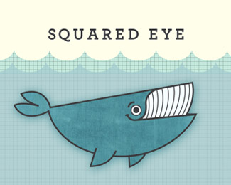
Squared Eye
by squaredeye • Uploaded: Mar. 06 '09 - Gallerized: Mar. '09

Description:
The Whale with a Monstrous Appetite for the Tiniest Details
As seen on:
Squared Eye's
Status:
Nothing set
Viewed:
28781
Share:
Lets Discuss
this is awesome! what a very sweet / retro illustration, great job
ReplyLicense to Ill-ustration!
Replyi love this whale! i'm a little perplexed by the name %22squared eye%22 and the whale's eye is round.
ReplyVery cool whale and color.
Replyjust love it
ReplyAwesome illustration!
Replyfun fUN FUN! love it!
Replynice!
ReplyI loved this whale since the first time I saw it on your website. Great design work!
Replynice whale :)
ReplyI remember seeing this on behance. Very nice, Matthew. Glad to see it in the gallery.
ReplyYep. Very nice!
Replycoolio
ReplyI love it!
ReplyGreat web site - Nice logo design
ReplyAs well as the whale I also love the grid background, it reminds me of a swimming pool...beautiful stuff
ReplyI guess I don't see what everyone is raving about, I don't find it all that great... and I actually respect many of the designers leaving comments. Then again, perhaps that is why my logos don't get floated all that often. This whole website perplexes me!
Replynice Illustration over there.*
ReplyUUUUOOOWWWW! nice nice logo! very style!
Replygreat illustration!.. you must have had a whale of a time doing this one!...
ReplyAwesome, love the look and feel! Is anybody here old enough to remember Fuzzy Felts? (if anyone thinks I'm nuts, Google that term) **Could you provide a little context for this though please? Wondering what the name means and how this gets the job done. Or was it just for fun? Thanks.
ReplyI absolutely love everything about this. Great work. Nice site, too.
ReplyGreat logo. Love your website!
Replylove the illustration, great work
ReplyGreat illustration:)
ReplyWhile I love the illustration and execution, I find it a terribly confusing name in relation to the mark and odd brand in relation to what you do. But that'll be up to your marketing efforts to trump those challenges.
Replythat bird looks too much like a whael
Replyagree with logoboom.
ReplyLove the font. What font is that?
ReplyShe is happy : )
ReplyI believe the font is Rockwell, but it could be any slab serif I suppose.
ReplyThis looks a lot like an illustration from my children's book.**http://supergood.ca/blog/2007_06_01_archive.html**Chad Geran**
ReplyVery cool illustration! That font is Archer, I beleive.
Reply...yeah...strangely similar. I can see the differences, though there aren't all that many.
ReplyBy the way I'm not making accusations towards %3Cb%3Eanyone%3C/b%3E, so leave your soap boxes back in the cupboard.
ReplySorry for the belated reply. I didn't bother to follow up :(**I am thankful for all the great compliments about our new logo. Able is responsible for it, and you can find their site here : http://designedbyable.com (which Squared Eye designed for them)**Able are an extremely ethical group, and so I can say with absolute confidence that the similarities to Chad's work and this logo are utterly coincidental, albeit remarkable :)! I saw Chad's design on ffffound.com about 3 months ago and have been looking for the designer ever since. Your work is outstanding! I love the book illustrations.**Thanks again,**Matthew
ReplyYeah, it's nice, amazing, great because Chad Geran created it first. I'm glad Chad made a comment on it. I'm surprised he hasn't asked you to cease using it, or at least fork over a little dough for his effort.
Replybeautiful style :D
ReplyPlease login/signup to make a comment, registration is easy