Home
Gallery
Activity
Creatives
Sign In / Register
Featured
Mototee
JohneryCreatives
Float
Spacewash
Kreatank
Float
Giraffe Milk Guide Logo
Proffalices
Float
rabrot
Ambi
Float
Tea Leaf Girl Logo
Proffalices
Float
Home Love Cares Logo
Proffalices
Float
Couch Corn
Mikylangela
Float
Friendly Hotdog King Logo
Proffalices
Float
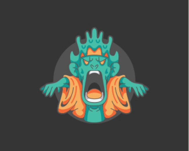
Cannabis Skull
Costoboc
Float
HunterCRM logo
BrandKing
Float
S, C
Artology
Float
Cute Construction Mole Logo
Proffalices
Float
Panda Bamboo Leaf Logo
Proffalices
Float
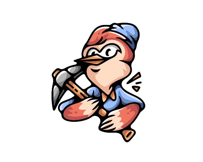
Lumberjack Woodpecker Bird Logo
Proffalices
Float
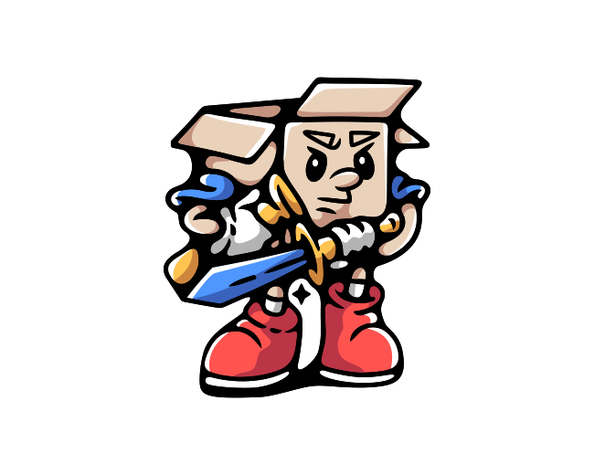
Sword Protection Box Logo
Proffalices
Float
More
Featured Artist: ImonUix
Follow
ImonUix
Logos :
80
Tourex Logo
ImonUix
Float
lettermark - monogram logo
ImonUix
Float
Cross Logo
ImonUix
Float
Robot Logo
ImonUix
Float
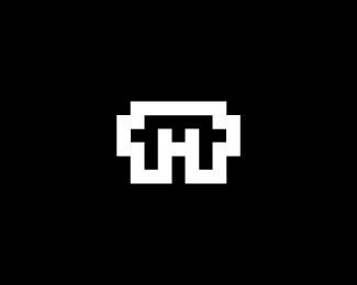
H Letter Mark Logo
ImonUix
Float
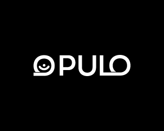
Opulo Logo
ImonUix
Float
Community Logo
ImonUix
Float
Sole Logo Design
ImonUix
Float
symbol mark
ImonUix
Float
Award Logo
ImonUix
Float
Techfan
ImonUix
Float
Modern, Creative, Letter M Logo
ImonUix
Float
Diverge - Logo Design
ImonUix
Float
K Logo
ImonUix
Float
DM or MD Logo
ImonUix
Float
Artificial intelligence, Futuristic, Technology
ImonUix
Float
Avtre Logo Design
ImonUix
Float
Letter W and Balloon Logo Concept
ImonUix
Float
Letter M Logo
ImonUix
Float
Marion Logo - Letter M Logo
ImonUix
Float
Recent Discussions
mbmhealth
Hi there Younique I like this logo and would like to use it
tycoone
Amazing idea
Shinobi
Nice conception!
autor12
cripi
elmickeylozano
@LPAdmin
Thank you! Just wanted to let the audience know that these logos are old.
amandananslie06
Hello! My name is Amanda. I am overjoyed with this type of design for my pet sitting business.[...]
More
Creatives
designabot
Follow
167 Identities
Following 185
285 Followers
Follow
Rakibul62
Logos :
175
Follow
AdamTheNumberOneMan
Logos :
26
Follow
artology
Logos :
293
Follow
LogoFolder
Logos :
19
Follow
moverdrive
Logos :
46
Follow
designer
Logos :
104
Follow
Littlecube
Logos :
4
Follow
Proffalices
Logos :
362
Follow
mikylangela
Logos :
110
Follow
gonzález
Logos :
53
Follow
plogged
Logos :
48
Follow
PROVOCO
Logos :
9
More
Logopond © 2006 - 2024
Contact: Management
|
Terms of Service
|
Privacy Policy
|
Advertise


Hi there Younique I like this logo and would like to use it