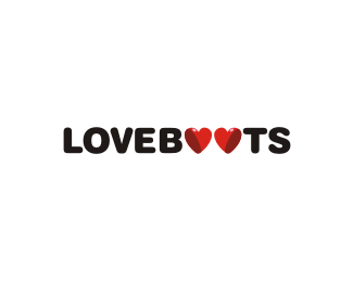
loveboots
by nido • Uploaded: Mar. 02 '09 - Gallerized: Mar. '09
Description:
wip.. childrens footwear store...
As seen on:
loveboots
Status:
Nothing set
Viewed:
12791
Share:



Lets Discuss
Love the concept. Maybe one shade darker for the boot bottom?
Replycheers Larry...
ReplyIt's just two hearts and then 'PING' the boots appear. Nice one chap.
Replyalso brilliant!
Replyincredible job nido!
ReplyMagical!
Replycheers fellas... boots all round! :D
Replylove it!
ReplyHaha! This is great, nido. Me likey.
ReplyIt springs up on ya
ReplyMakes me smile, really really nice.
ReplyOh, there they are!! Nice one, Navster.
Replythanks for the kind words people... but you can do better :D
ReplyMakes me want to see the heart/boots as a larger part of the logo. It is almost too subtle. I'm not completely sold on the font for the rest. A little too much puffy with everything rounded.
Replythanks Trish for taking a look %26 saying what you thought... I have a version with the hearts/boots separate... will see what the clients like..**...but having said that subtlety in logos is never an issue %26 should not ever need to be... i disagree with anything being %22too subtle%22 if it is secondary to what the logo is trying to get across.. in this instance %22loveboots%22.. not %22clever little hearts/boots%22.. see what i mean?**as for the type.. rounder type or %22puffy%22 as you call it bodes well with the %22child/parent%22 market... especially in this day %26 age when you see things at such a rapid pace...
ReplyTrue on the font, but I could use the same argument about subtlety. When I say it is almost too subtle, I am afraid a large part of the target audience won't see them as boots (ever). Not saying you should change it. I love what you have. This is one of those logos where when you do see the hearts as little boots it is like getting a little gift. The choice as to whether you dumb it down for the target audience is up to the client in the end.
ReplyClever %26 Creative!
Reply%22When I say it is almost too subtle, I am afraid a large part of the target audience won't see them as boots (ever).%22... I know its almost a clich%E9.. actually.. it is... but a majority of the people in the world wont notice the arrow in FedEx (ever).. the question is.. what is important?**%22Clever %26 Creative! %22... hhmmm... you got me there... good one!
ReplyI was thinking of the FedEx logo when I wrote that. I don't think it is about what is more important. It is about what works. Advertising/design sometimes falls into a moral/passionate issue when it is really about what works.**I think your logo works regardless of whether the target audience sees the boots or not. Same with the FedEx logo. Forgive me for waxing on about something that really has to do with other, overly clever, logos I've seen.
Reply... thanks.. :)
ReplyThe letter %22 O %22 is s flexible one everybody can do something in that ... but ur %22TALKMORE is awesome... :)
Reply@ClimaxDesigns... and you cant start a sentence with %22And%22... %3B)**thanks alterego :D (no... that's not the 'other' me!)
ReplyOMG AWESOME
ReplyThanks ClimaxDesigns! I admit to loving a good debate... Thank you Nido for being an intelligent foil.
ReplyI'll second that. Thank you Nido for being an intelligent fool.
Replysometimes I think my antiquated but expansive vocabulary is completely lost here. %3B)
ReplyGenius!!!
Replyif it weren't for you I'd probably never get any floats! dam, I hope that doesn't drop you in a deep depression. let it out with a good cry.
ReplyHoly crap! Took me a minute to see the boots - awesome! I agree about having te boots as a separate element - they don't read perfectly as Os.
Reply%5E reads fine. but I saw loveboobs for the longest time.
Reply%5E lol Mike. You too :)
Replyyep, but I think I see that in every logo.
ReplyLove this design...boots and all!
Replydeceptively clever and simple.
Replyargh, that took me ages to finally see then *click*!**great work, i always like a logo that almost acts as a puzzle :)
Replyawesome logo dude
ReplyWOW WOW WOW. awesome.
Replyyep, didn't see it in the galley, so wandered in to see what the fuss was about and fuss deserved!**looks like their on there way to jumping in a puddle on that angle.
Replythank you everybody for your thoughts... really appreciated...
Replynido just told me on msn he doesn't care what any of you think....sorry
ReplyHah, i'd still comment**I did wonder wat so great bout this logo tat it is in the gallery, and then lightening struck, well done Nido :)
Replyi think its perfect just as it is - there's no need to see the boots - it's not like i'm not going to understand what it's for if i don't see them right away - or at all.
ReplyVery cool... great concept!
ReplyAl%EDilamoolo... :D*
ReplyVery cool, clever concept. I don't think this could have been executed any better.
ReplyReally nice .. took me a few seconds to see the boots .. but when i saw them .. WOW!
Replywow this is the fasteset floated logo ever I reckon! in 11 days you've had 154 floats woah! congrats!
Replyhindmarshdesign i was hoping that your logo would appear in top eight list. the thing is, this site has a problem, if you push the floater several times at once it will give you not one floater, but several floaters. somebody pushed it several times for those guys. i wonder who?
Replyyeah.. that is strange...
Replywoooow!!! :D
Replythank you nima %26 oronoz!...
Replyyeah.. haha.. im crazy!
Replyomg so so good man!!
Replywoo! nice work man
Replythanks danny %26 designabot!...
Replynido I really like this!!*and I have to recognize that I have never seen the arrow in the FedEx logo until I read it here... :P
ReplyOMG! love boots!
ReplyLooking through old comment threads never fails to crease me up. LMAO.
Reply%5ELOL!... its like watching reruns of fawlty towers huh!...
Replycrazy cool Nido!
Replythanks Noetic... forgot about this one... your stuffs crazy cool too btw... just checked it out... nice.
Replyyeah, this is one of the very best!
ReplyI love boobs. Ha
ReplyIt takes two Mike ;)
ReplyDan, thanks! I always thought so too.
Please login/signup to make a comment, registration is easy