advertisment

Wallpapers Direct

by Bernard Kowalski • Uploaded: Dec. 07 '06
Gallerized Dec. '06 0fa8e019ce88d58dd9cb01acf083a882.png
5700

Description: 
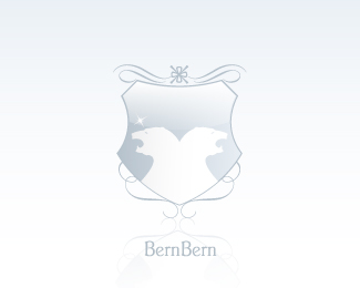
Proposed logo for a wallpapers website.

Status: Nothing set

Commenting: Not seeking critique, comments fine

More from this user:

heavywinter said on Dec. 11 '06

I feel this one needs a lot of work: The mark is too complicated with its plaid pattern. The mark doesn't really say wallpaper to me; instead, because of the gloss treatment, it looks more like an object such as a tile. The relative weight/size of the words versus the mark is going to cause readability and proportion trouble when reproduced at larger and smaller sizes.

kiddgraphicdesign said on Dec. 11 '06

It looks more like tile or laminate flooring than wallpaper and the pattern looks like a plaid shirt to me.

Bernard Kowalski said on Dec. 12 '06

Hmm, good points. I agree it looks to have too much weight and "thickness" to be wallpaper. The sizing wasn't much of an issue with an altered pattern.

ClimaxDesigns said on Dec. 17 '06

I think you guys are missing this one, this is a website logo so proportion has not real bounds here. and 'wallpaper' to web designers can indeed be patterned backgrounds you use for wallpaper backs or textured bacground drops on websites.

Bernard Kowalski said on Dec. 18 '06

Another note, the pattern is actually that of a real wallpaper, that I have a photo of. I think the context of the logo determines what you can "get away with". A logo that will be on-screen only affords different things than a globaly adapted logo.

James K. said on Jun. 07 '07

I have to agree with heavywinter. The logo is very complex and whether it is just for a website or not I think it should be flexible enough to use in other media.

Please login/register to make a comment, registration is easy,

Logopond Book V1 - PreSale Now!