view42
by HelveticBrands • Uploaded: Dec. 04 '06 - Gallerized: Apr. '08
Description:
Identity for a new webdesign firm in Nottingham
As seen on:
http://www.dache.ch
Status:
Nothing set
Viewed:
11862
Share:
Lets Discuss
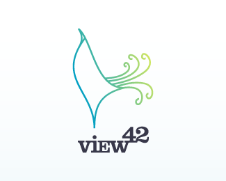
I saw a rooster. The strength in the symbol I think, is not the type of bird but the abstraction of the bird. Whatever bird it is, it's cool.
ReplyIs there a connection between the peacock, the %22view%22, %2242%22 and the fact that it's a design company? It's a nice logo, but I don't get it...
ReplyI'll upload the updated version when I get some time. Here it is, like on my portfolio %22http://www.dache.ch%22:http://www.dache.ch**!http://dache.ch/images/view42.png!**tevih, the connection can be seen in the word view. A peacock full of pride is all about being viewed. The shape of the bird could also be considered as a 'v'. **Cheers guys.
Replyive always liked this.. however i would have suggested perhaps making the 'tail' longer %26 taller.. as that is when a peacock is at its most proudest.. this one seems to be proud of having a 'small one' %3B)
ReplyFair points.
ReplyI think that's over thinking it a bit. Aesthetically, if the tail were longer, I think it would be off balance.
Replynow your under thinking it%3B).. i also said 'taller'.. so it rises vertically %26 above the head.. as a peacocks tail would when its strutting its stuff.. aesthetically.. if done correctly.. that would be fine.
Reply-127? why?
Replygood design, Dache !
ReplyThanks
ReplyThanks Dalius :%5E)
ReplyPlease login/signup to make a comment, registration is easy