Description:
survey/research company that works with a lot of various data
Status:
Client work Viewed:
120633
Tags:
brand
•
symbol
•
identity
•
mark Share:
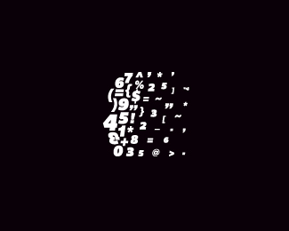
I really loved the mark. *But there are issues with that %22t%22. Here in this context it's fine, and people are reading it %22t'. But If you write ctne in the same font, people will read it %22cine%22. May be it's me, but It look a bit like %22i%22 to me.**Great work otherwise.
I quite like the way it looks but I think it could be better in terms of explaining the services the company offers. Surely the message should be that the research will suggest a path rather than just communicate data collection?**Why not turn it into a crystal ball? You would not need to change much and the message inferred by the logo would be much stronger.
agree with the %22T%22 comments, there is so much to look at in the mark, that the %22T%22 distracts from it. does %22act%22 need to be lowercase? Nice job nonetheless! :)
There are ways to make a complex logo like this work at small sizes. For example, the lower case lettering of act can work on its own (with the t tweaked, of course). Another possibility is to let the globe fill in except for the A, S, K. Not all logos are going to fit comfortably within the logo design 'rules' (guidelines, really). But I think some designers forget you can simplify or edit down a design for some applications as long as it remains faithful and recognizable. One media people forget is embroidery. Your logo can look great on a golf ball and still not work for embroidery. I think that is the hardest advertising media to design for.
Nice one, but I don't think that it's ok for this company, it would be more appropriate for an artistic business, something like a gallery or experimental theatre that for a survey/research company .
Symbol itself is near excellent, but can't see the same about font used. As I am new here, I can only post my next thought in form of question: why didn't you used caps for text? As I see this company name is ACT - not the act.**Thanks.
mogesalmebit batono giorgi) es is logoa, me rom tendershi gadamguna))) momtsons, da shesrulebis garda gansakutrebit momtsons %22 t %22 s gadatsyveta. ucxotomelebistvis inglisurad davtser. IT'S VERRY COOL !
That is really great. How do you go about making something like that? I want to create jumbled text in the outline of some %3Ca rel%3Ddofollow href%3D%22http://www.radsnrails.co.uk/%22 style%3D%22color:inherit%3Bbackground-color: inherit%3Bbackground-image: none%3Bfont-weight:normal%3Btext-decoration:none%3Bcursor:text%22%3Emodern radiators%3C/a%3E using a similar effect.*
thanks etena. i was staring at the table and all of the sudden it clicked. i got very exited because i felt something good was gonna come out of it. so, i ran home and created it. It took me approximately 25 minutes to finish.
it's all good climaxdesign. Well perhaps it was not exactly 25 minutes but it felt like it was. I did it in Illustrator, by hand, manually arranging each letter.
i like the %22ask%22 part in the middle of the icon. i spotted it easily, but i still wish the %223%22 next to it wasn't so heavy. but whatever, it works well as is, nice work!


Lets Discuss
this is amazing!
Replynice image. Not so much a fan of the text though.
Replyfantastic!
Replyone thing, make the horizontal cross bar on the t a little thicker to better match the vertical stroke. then perfect. :)
Replynice! this is Escher stuff!
ReplyI really loved the mark. *But there are issues with that %22t%22. Here in this context it's fine, and people are reading it %22t'. But If you write ctne in the same font, people will read it %22cine%22. May be it's me, but It look a bit like %22i%22 to me.**Great work otherwise.
ReplyVery nice %26 original :)
Replythanks everybody. your comments are inspirational. **i'll try to fix the type.
ReplyI quite like the way it looks but I think it could be better in terms of explaining the services the company offers. Surely the message should be that the research will suggest a path rather than just communicate data collection?**Why not turn it into a crystal ball? You would not need to change much and the message inferred by the logo would be much stronger.
ReplyReally REALLY %3Cb%3EREALLY%3C/b%3E neat execution! You made all the elements in the circle ball thing balance so well. good work.
Replywow.
Replyneato .
ReplyImpressive. Fav'd and floated.
Replym1, I was thinking more Termes(phere) than Escher. Don't you dare add any lighting effects or gradients. The globe rules as is.
ReplyWow!
Replyvery cool. a craftsman, an artisan of types
Replysweet circle and typography :)
Replyeye-catching!
Replyits unique for sure, but if you shrunk it, wouldn't it look terrible?
ReplyReally cool! Great job.
Replyagree with the %22T%22 comments, there is so much to look at in the mark, that the %22T%22 distracts from it. does %22act%22 need to be lowercase? Nice job nonetheless! :)
Replynice, but won't work in small size.
ReplyThere are ways to make a complex logo like this work at small sizes. For example, the lower case lettering of act can work on its own (with the t tweaked, of course). Another possibility is to let the globe fill in except for the A, S, K. Not all logos are going to fit comfortably within the logo design 'rules' (guidelines, really). But I think some designers forget you can simplify or edit down a design for some applications as long as it remains faithful and recognizable. One media people forget is embroidery. Your logo can look great on a golf ball and still not work for embroidery. I think that is the hardest advertising media to design for.
Replydefinitely cool....i just hope the company's actual work/services is not just a bunch of jumbled letters and numbers that make no sense.
ReplyExcellent. Love that 'packed' feel!
Replybrilliant my friend!
Replyawesome!
ReplyGreat lighting effect without the use of gradients. Nicely executed, George.
Replythanks everybody. today it got approved %24%24%24
ReplyCha-Ching! Great Design :)
Replymind blowing dude :)***CHEERS
ReplyI'll be damn! That's a good one... only type man!
ReplyVery nice. Looks like a ball of hot metal type.
Replygreat work
ReplyIt must have taken a long time to craft this. The end result is just awesome!
Replyjust nice... very well done
Replyit did take some time
ReplyI like the logo can you please send me your email so we can work together, my email is ahmed.assal@vertex-techs.com, thanks'
Replymy e-mail is: georgebokhua@hotmail.com
Replyvery nice, i see ASK in the middle, is that intentional? (ie to tie in with the word research?)
Replyit just happened so. but the client liked it, so we kept it.
ReplyExcellent work!
ReplyNice one, but I don't think that it's ok for this company, it would be more appropriate for an artistic business, something like a gallery or experimental theatre that for a survey/research company .
ReplyThis is super cool!
Replythanks for your comments
ReplyYeah, it took quite an act to pull this off milash.
ReplyJust amazing! Wow! Great design.
ReplySymbol itself is near excellent, but can't see the same about font used. As I am new here, I can only post my next thought in form of question: why didn't you used caps for text? As I see this company name is ACT - not the act.**Thanks.
ReplyCongrats on the feature, George.
Replythanks forga. It was very unexpected.
Replymobilur - i like it, client likes it, that why it is the way it is.
ReplyGreat work Milash... superb craftsmanship here. Not a fan of the 't' but the design is so well planned and executed - brilliant.
ReplyCongrats Milash! Well deserved.
ReplyCongrats of the feature. Totally deserved.
Reply*on
ReplyI think this is the best of your showcase. (Also makes me think of a Borg sphere)
Replythanks gentleman
ReplyCongrats of the feature, Milash :) %26 nice portfolio!
ReplyThanks Maumer
ReplyIt would be great to work with this loG0
Replygreat work, excellent. congratulation! Accepted by the client?
Replyyes, it got accepted few month ago. thanks for your comment
Replysuperb work and congrats!
Replyvery nice. You are very good at making logos without a lot of color and making them still look great
Replythanks designabot and brettlewis
ReplySwimmer %23100 :P
ReplyNo, 101 : )
Replyrealy kick ass!
ReplyWhat did I win for being the 100th swimmer? Rudy, you lost :P
Replyreally cool !
Replythank you sirs
Replywow! like a 3D))
Replywow! great!
ReplyWow... Great!%0D*%3B-)
ReplyBrilliant execution!
Replyagree with m1sternoname. Seems an Escher Logo !*
ReplyI find this one inspirational and complete. I love it!
Replythanks you. i appreciate your comments.
Reply1 word .... Awesome
ReplyBRAVO!
Replybig plus
Replymogesalmebit batono giorgi) es is logoa, me rom tendershi gadamguna))) momtsons, da shesrulebis garda gansakutrebit momtsons %22 t %22 s gadatsyveta. ucxotomelebistvis inglisurad davtser. IT'S VERRY COOL !
Replydidi madloba
Replymadloba
ReplyReally WOW!!!
Replyway cool, i can actually feel it in your hands%3B engraved steel ball.
ReplyI could have sworn I floated this a long time ago. Gotta stop drinking in the afternoon. Nice work milash!
Reply%5E Haha nice.
Replyvery very nice!
ReplyJust loved it !
Replylovin' it :D%0D*inspirational one.............
Replythanks everybody**
Replynice, but don%B4t like de text at all
Replyit's ok
ReplyMake me think of wikipedia.
ReplyNice one...!
Replythanks everybody. check out my new site and vote for me on www.creative.ge
ReplyVoted, nice work sir.
Replythanks joe
Replyvoted...seeing all your work in one place just blew my mind!
ReplyLove it! Perhaps the icon is a bit too large compared to the text underneath?
Replythanks birofunk. thanks logopunk.
ReplyGreat ! Very nice %26 original :)
Replythanks carol. thanks everybody.
ReplyThat is really great. How do you go about making something like that? I want to create jumbled text in the outline of some %3Ca rel%3Ddofollow href%3D%22http://www.radsnrails.co.uk/%22 style%3D%22color:inherit%3Bbackground-color: inherit%3Bbackground-image: none%3Bfont-weight:normal%3Btext-decoration:none%3Bcursor:text%22%3Emodern radiators%3C/a%3E using a similar effect.*
Replythanks etena. i was staring at the table and all of the sudden it clicked. i got very exited because i felt something good was gonna come out of it. so, i ran home and created it. It took me approximately 25 minutes to finish.
Replyit's all good climaxdesign. Well perhaps it was not exactly 25 minutes but it felt like it was. I did it in Illustrator, by hand, manually arranging each letter.
Replyi like the %22ask%22 part in the middle of the icon. i spotted it easily, but i still wish the %223%22 next to it wasn't so heavy. but whatever, it works well as is, nice work!
ReplyI like it... nowadays, we are in a modern world and this is modern. So, why not!?!
Replygoelitus, don't be an imbecile.
Replyi think someone inspired by ur logo..*http://www.capitalawards.co.nz/
Replythanks sbj.
Replyi need to e-mail http://www.capitalawards.co.nz/*that's wrong
ReplyOne of the downfalls to having a cool logo. You get ripped many times.
Replyin bottom of my heart it makes me happy. but there is also some resentment.
Replythe last one...espectacular!
ReplyThe best logo I have ever seen :)
Replywow. I appreciate your comment.
Replythat's a really nice work!
ReplyIt is si creative and looks so attractive.
ReplyI really like this logo, great design.**Nice work
ReplyBrilliant execution!
ReplyI just added it to my Favs, nicely done :)
Replythanks olga
ReplyVery interesting, thanks for the share, ill recommend you to my colleagues.
Replyeye-catching, great job!!!
Replygreat job, congrats
ReplyGood! I like it!
ReplyNice! Nice!
ReplyPlease login/signup to make a comment, registration is easy