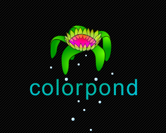
Hummingbird
by maxrho • Uploaded: Feb. 11 '09

Float
(Floaters:
3 )
Description:
Another one of these vectorcolorthingies.
Status:
Nothing set
Viewed:
8128
Share:

Lets Discuss
it's a beautiful hummingbird, how does it look without strokes applied? without the strokes it will allow the colors to blend a little more together. also maybe you could try another font?
Replygorgeous either way.
ReplyNice execution
Reply@gyui: Without strokes the colormasses gets really blended and you cant see all the nice cuts that i spent a rally long time perfecting, and supriseingly much of the feel or the logo is lost! I promise, much better with strokes! And yeah didn't care much about the font tbh. maybe i should fix it to complete the logo? got any suggestions? always fun to hear other peoples ideas about typefaces!**@shirak thanks!! :D*@joshua thanks!! :)**
ReplyA stunningly beautiful illustration... but I'm afraid it is not such a great logo though.
ReplyMax you there? love the logo. I'm interested in having you do a version of this for a new product. How can I get in touch with you?
ReplyPlease login/signup to make a comment, registration is easy