Elysium Skies
by willhowe • Uploaded: Feb. 06 '09
Description:
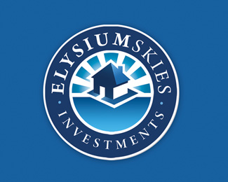
Logo design for a property investment company heavily influenced by the aspect of heaven and sky in the title 'elysium'
Status:
Nothing set
Viewed:
4443
Share:



Lets Discuss
Nice overall - the colors are great. Personally, I would have shifted the house down within the circle more and made it slightly larger - the blank space that's currently below the house is HUGE. Also, why do you have the house on the tiny square shape? It seems very unnecessary.
Reply%5Eagree with sdijock about the space below the house, I think moving that down will help.
ReplyGreat logo design willhove :) I like it**Carried in Cruzine: http://www.cruzine.com/2010/09/27/real-estate-logos/
ReplyPlease login/signup to make a comment, registration is easy