by jurikov • Uploaded: Jan. 25 '09 - Gallerized: Jan. '09
Add to Pad (In 45 Pad s )
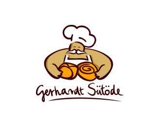
Description: Created for a bakery. Status: Nothing set Viewed: 18230 Share:
very cool illustration! nice job
Great work! Have you tried a white moustache?
i like the white moustache idear. I also feel like i want to see one of the dark outlines connect his arm to his head. Great illustration, nice work.
T%E9nyleg k%E9ne a feh%E9r bajusz hozz%E1! Am%FAgy nagyon sz%E9p munka! Ott a pont!**
3 for the white moustache idea. Looks like this guy eats all the Bread. Must be good stuff.
I actually love the text, illustration very nice too
Cute!
Very nice,has a nice family bakery feel to it!
Great logo, Kovacs. You have a nice body of work. I also think a white mustache would give the logo more depth.
I always liked the freehand feeling of some illustrations in logotypes.
Love the style - nice work
Thanks, guys. You can find the updated version with white mustache in my showcase. :) You are right, it's better with it. So thanks the advice.
J%F3pofa ez! Sz%E9p portfolio!
nice ilustration... is joyful
Sz%E9p munka! Gratul%E1lok!
Seems very reminiscent of the Panera Bread company's logo to me... Must be a %22bakery%22 thing.
Thank you everyone.**to D.Roarks: is it similar? Yes, both of bakery logos illustrated a human and some bakeries. But i think there are %22some%22 differences. By the way I haven't seen this logo yet.
Great work!!! Love it!!!
Great logo, love the illustration style here.
Great illustration!
Please login/signup to make a comment, registration is easy
Follow

Lets Discuss
very cool illustration! nice job
ReplyGreat work! Have you tried a white moustache?
Replyi like the white moustache idear. I also feel like i want to see one of the dark outlines connect his arm to his head. Great illustration, nice work.
ReplyT%E9nyleg k%E9ne a feh%E9r bajusz hozz%E1! Am%FAgy nagyon sz%E9p munka! Ott a pont!**
Reply3 for the white moustache idea. Looks like this guy eats all the Bread. Must be good stuff.
ReplyI actually love the text, illustration very nice too
ReplyCute!
ReplyVery nice,has a nice family bakery feel to it!
ReplyGreat logo, Kovacs. You have a nice body of work. I also think a white mustache would give the logo more depth.
ReplyI always liked the freehand feeling of some illustrations in logotypes.
ReplyLove the style - nice work
ReplyThanks, guys. You can find the updated version with white mustache in my showcase. :) You are right, it's better with it. So thanks the advice.
ReplyJ%F3pofa ez! Sz%E9p portfolio!
Replynice ilustration... is joyful
ReplySz%E9p munka! Gratul%E1lok!
ReplySeems very reminiscent of the Panera Bread company's logo to me... Must be a %22bakery%22 thing.
ReplyThank you everyone.**to D.Roarks: is it similar? Yes, both of bakery logos illustrated a human and some bakeries. But i think there are %22some%22 differences. By the way I haven't seen this logo yet.
ReplyGreat work!!! Love it!!!
ReplyGreat logo, love the illustration style here.
ReplyGreat illustration!
ReplyPlease login/signup to make a comment, registration is easy