Precision Networking, final
by epsilon • Uploaded: Jan. 22 '09 - Gallerized: Jan. '09

Float
(Floaters:
63 )
Description:
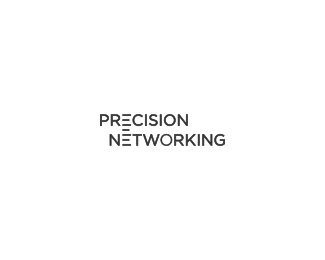
Finalized version of the logo for a high-tech startup in the area of the network monitoring.
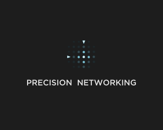
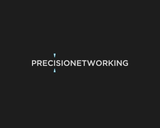
See here for other versions that were considered, but didn't make the cut.
As seen on:
www.precisionetworking.com
Status:
Client work
Viewed:
29684
Share:


Lets Discuss
Version 10 or 11 or whatever .. finalized it at last.
ReplyVery well executed bro, I really love the simplicity and expressiveness of this brand!
ReplyPerfect solution.
Replythis is fantastic--spot on!
Replyi think you finally nailed it. well done.
ReplyThanks, guys. This is as simple as it gets while still having a meaning.
ReplyGreat
ReplySpot on.
Replygood solution, along with the network connection.
ReplyVery creative solution. It works well!
ReplyNice job epsilon, I'm sure you're happy to get this one out the door!
ReplyVery nice, congratulations!
ReplyVery nicely done.
ReplyYeh well done this is real good
ReplyMucho grasias, seniores. I'm glad you concurred with my wife :-)
ReplygraCias
ReplyThis is my favorite of them all.
ReplySimple is best. Well done.
ReplyWhat he, he, he, he, he, he, he, and he said.
ReplyBravo!!!!!!
Replycongratulation, fav of all ... good job
Replydoes it intentionally have a somewhat 'cisco' feel to the bars? I'm not suggesting a copy, but I think the subtle similarity helps to enforce the industry without reading the text.
ReplyThanks again, guys. **@relevant: hardly a hard work really :) more of a persistence and no firm time constraints**@cobaltcow: a couple of people said the Cisco bridge was the only thing they actually saw in this version, others said it was noticeable, but didn't stick out. I polled few CCNEs (Cisco certified network engineers) and none of these guys saw it. Personally I don't see it, but just as you said it's not bad to have it there.
Replybest of the lot!
Replycongrats.. nice job..
ReplyI think the vertical orientation helps further distinguish this from Cisco.
Replyclean and effective!
Replycongrats!
ReplySimple and good, just, perfect. Great job!
ReplyI like this logo because of the clever way of utilizing E letters as the metrics of a ruler. I was always fond of designer who could take characters to another level and turn them into meaningful icons while retain readability. This is precisely achieved here. The whole logo, it's sharpness and industrial look emphasizes the precision even more. Kudos.**I've included it in my weekly roundup @ http://f055.net/article/favlogo-roundup-number-1/*
ReplyWell done and clever.
ReplyUpdated the type slightly. A bit heavier now.
ReplyOnce again! (Seriously dig your work!) :) Nicely done!
ReplyAbsolutely perfect solution. Congrats man.
ReplyThis is smart.
Replylove this! simple, yet memroble...its the definition of good!
ReplyPlease login/signup to make a comment, registration is easy