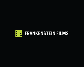
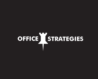
Horror Films
by Siah-Design • Uploaded: Jan. 20 '09 - Gallerized: Jan. '09

Float
(Floaters:
186 )
Description:
It's so simple it's scary...
Copyright Josiah Jost and Siah Design © 2009
Status:
Nothing set
Viewed:
50007
Share:
Lets Discuss
Hehe! Nice one!!
ReplyI think the type can be improved. I think the mark is delicious.
Replysweet
Reply*Hey Siah....I love this! Very cool:)*
Replycleaver mate :)***CHEERS
Reply@Elisteli, @Lundega, @artspasm, @Patrick, @Tareq: Thanks guys! :) Appreciate it.
Replyhaha awesome, very nice and clever
ReplyThanks Sean! :)
Replynice concept
Reply(: gorgeous idea... nice work
ReplyGreat thinking, Josiah.
ReplyHehehe .. this should go into a %22sneaky use of everyday things in logo design%22 book :)
ReplyI really like it, it%B4s simple and clever!
ReplyBOO!
ReplyThanks for the comments everyone! Once I get a concept in my head and then go to execute it I usually end up realizing that it can be even more simple than I first anticipated.
ReplyThis is awesome!
Replyanother great one Siah.
Replyhaha, i love it
Replymissed this nice work
ReplyReminds me of Frogra's shocked logo but still very clever they can both co-exist.
ReplyThis is amazing! Made me laugh - great work!
ReplyO: hahaha great work!!
ReplyAre you kidding?!?! This almost made me choke on a mouthful of apple as I glanced passed it :) I can't believe how frickin' awesome this is!!! *
Replyvery simple yet so well done
Reply@ Koodoz, man you must have a big mouth %3B-).
ReplyClever use of the reel, but it took reading the comments here to realize that the reel was supposed to be a face (it is, right?). Would it be possible to add something extra to make it more apparent?
Reply%5E NO! welcome to the wonderful world of logo design. Less is more.
Reply@ machawk1, You just have to know when and where to apply it.
ReplyFloated and faved!
ReplyThanks for the comments everyone! I definitely agree with you, Mike. %5E**LOL, almost choked on your apple, eh Koodoz? A lot of people I've shown this to have laughed out loud. I guess it has that effect... :)
ReplyGah I'm such a sucker for personification in design.
Replysimple and successful logo. great idea.
ReplyThanks Lunde and Within. :)
Replyahhh simplicity. perfect. love it.
Replyis this a real logo
Reply@raja This is a fictional logo. The concept is up for sale at IncSpring though... %22shocking films%22 would work better for a real company. :0
ReplyA bit underpriced IMO. Nice work.
ReplyOUUUUUUUU aahahhhhhhhhhhhhh!!!!!!!!!!!!
Replyyour a genius.
ReplyApart from the horrible typeface and the fact that it looks like it was designed in MsPaint... I got a cheap laugh out of this clever design
ReplyThanks Roy and prwhitehead and Sean (I think :) )**@neveronyx: Glad you got a kick out of it. The font is Gotham light and it was designed in Adobe Illustrator. :) Please enlighten me as to why it looks like it was done in mspaint... :)
Replysimply brilliant.
Replyvery simple.....yet impressive...good job Siah
ReplyDidn't get it. The concept of films is covered but what about the Horror Part? Anyway, I like it.
ReplyOh... Oh!!! Now I get it! Sorry for my distraction.
ReplyLOVE IT!
Replygenius idea and wonderfully executed.**my only thought is that the icon doesn't make any sense without the title, so maybe the text could be slightly heavier?
ReplyReally really clever concept, seems to be a bit of a disconnect between the type and icon though...excellent work, but with a bit more work it could be flawless.
ReplyOriginal %3B)%0D*Nice !
Replythis is sooo good!
Replythis is awesome!
Replya very good friend
Replybrilliant - I adore the simplicity and wit!
ReplyCheck out his whole portfolio.. He is defiantly one of the more wittier ones %3B)
ReplyI didn't see the mask at first. I saw a bowling ball. Granted, I'm not a horror movie fan, but even knowing the history of horror and the hockey mask (that is the connection, correct?), the connection took me more than a minute. **I love the simplicity of the type, it seems most production companies are going clean like that.
ReplyThought this was very clever, I'm not sure that the face is entirely apparent as a film reel, it might be too much smiley and not enough depth. Maybe adding more detail to the film reel will help, just slight details though.
Replyneveronyx said: %22Apart from the horrible typeface and the fact that it looks like it was designed in MsPaint... I got a cheap laugh out of this clever design%22%0D*%0D*quite obviously a random, non-graphic designer stirrer.%0D*%0D*(I've come in late I know but i just wanted to say that)%0D*%0D*Awesome work Siah. I think the reel could be seen in a few different ways and thats why it works so well. It could be the face of a ghost, it could be a mask, it could be a horrified expression, it could be someone so scared they went white with fright...and beyond all that, it definately looks like a film reel. :)
ReplyHaha, thanks for the comments everyone. %5E I really admire the work of so many of you guys that have commented and it means a lot to get feedback from all of you!
ReplyMy favorite logos are the ones where the client must be saying %22do I really need to pay full price...that must have taken you two minutes.%22 I love the simplicity. The idea is impressive. Great work.
ReplyHaha. Absolutely love this one! So simple and clever!
Replyfun in horror :-) witty work!
Replylol, MS PAINT?**Great logo mate!
ReplyDude this is so funny! I will admit I have a soft spot for logos that turn inanimate objects into faces (never been much good at it myself though). Love it! Keep up the good work.
ReplyNice thought!!!
Replythis make me a smile.! good job
Replygreate funny crepy conpect :o
Replyauthentic creativity...gr8
ReplyLove it! Clean, cute and to the point! :)
ReplyI don't like horror movies, but i love your logo! nice and simple. Just love it!
ReplyBrilliant.
ReplyIt's so simple it's scary... **Scary? I'd eat him for lunch %3B-)
ReplyLOL, no Mikey, its not a chocolate chip cookie. %3B)
Replyperfect concept
ReplyHaha, love it. Couldn't be any more simple.
Replysimple and perfect!
Replyamazing concept. Stands the test of time due to its simplicity!
ReplyThis is without a doubt one of my all time favorites Josh! Man it's so simple and narrative!
ReplyThis is without a doubt one of my all time favorites, too. Perfect!
ReplyThanks again everyone! Just hit 100 springs.. cheers :)
ReplySpot on! Great job.
Replygreat
Replyso clever!*love it :)
ReplyAlways liked this one Josiah, so simple.
Replythe man who conceived this one is definitely a genius :)
ReplyThanks again everyone. @datzebao: You don't really feel %22genius%22 when you come up with these concepts... feel more surprised by them.
ReplySpooky good!
ReplyIt's so simple, but look good
Replybest 8)
ReplyCan't believe I never floated this.
ReplyThe beauty of simplicity!
ReplyThis is one of my all time favorite logos (I saw 2 years ago for the first time). Great desgin.
ReplyJust wanted to let you know, I found my Quote Kid design in this guys Behance portfolio and when I investigated a little more, I saw this design of yours in one of "his" projects. https://www.behance.net/gallery/17548559/Logo-Design-(4)
Replylike it!
ReplyI need a logo for my movie app Terrarium tv. This is a movie streaming application for Android devices. If anyone create one for me, let me know. For more info about the app, visit terrarium official blog: https://terrariumtv.io
ReplyPlease login/signup to make a comment, registration is easy