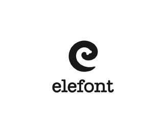
elefont
by Logomotive • Uploaded: Jan. 20 '09 - Gallerized: Jan. '09
Description:
I have a few reasons why sometimes I design fictitious logos. 1. when inspiration hits me I don't want to forget about it. 2.Usually whenever your thinking of something, so is someone else.3. because I enjoy it.4 it gets my creative juices flowing.5. It may come in useful in the future.
As seen on:
www.logomotive.net
Status:
Just for fun
Viewed:
49133
Share:
Lets Discuss
He does it yet again! That's really trunky!
Replydamn this is great!! :D
Replynice one, well done, buddy.
ReplyThat is awesome! :)
ReplyShow-off! :)
ReplyReminds me a little of Enlargel by Raja.**Great idea, though.
ReplyThanks guys, yeah I'm a show off!*Lundeja, did Tonfue's comment inspire you to say that :-)
Replyhaha really nice mike, great job
ReplyHaha, that must have been it!
ReplyTrunkmaster Flash
ReplyClever mark Mr.E :)
ReplyReally great mark. Really really great.
ReplyO H M Y!!
ReplyVery beautiful Mike :)
ReplyI don't know how you keep coming up with these ideas but...keep coming up with these ideas.
Replygreat
ReplyMikey, Mikey, Mikey, can't you see, sometimes your work just hypnotize me!
ReplyPPPlease teach me oh great wise master%3B)
Replyi was thinking you could make it one step better if you made the black piece look like a trunk as well, if thats possible. just a thought.
Reply%5E %5E Hmm. Stellar concept, Mike.
ReplyI like, I like... no actually I LOVE! great job
Replyelefantastic!
ReplyHow bout %22FONTASTIC%22..?
ReplyThanks for the comments fellow designers.
Replyclever!
ReplyWhoa! Nice. Next task... design a whole (ele) font round this concept. *That would be pretty sweet %3B)
ReplyA clever cookie indeed. The 'e' even looks like a tusk!! You're too good :)
ReplyMike hits again!
ReplyGeez thanks guys. *@Neil not a bad idear.
ReplyFloated a while ago but never gave my congrats. This logos works awesome Mike :)
ReplyNo words :)***CHEERS Mike
Replyworks great! TOP elefont!
ReplyWell played
ReplyI just picked up on another factor that makes this logo great! It's the type! The slightly rounded ends of the serifs complement the tip of the elephant's trunk, perfectly.
ReplyNow I know exactly what God meant when he said, %22Thou shall not covet%22... Serious Skills!
ReplyCheers guys and thanks for the observations and nice comments.*jp2id, LOL .Thanks.
Replyhahaha your a dork.. I just saw this.. Great man..
Replyvery catchy. :)
Replyhaha, nice and funny :)
ReplyGreat one!
Reply%5E Thanks guys.
ReplyHehe, great idea :)
ReplyInteresting!
ReplyWhat a nice idea with a perfect execution!
Replyis very funny the mental delay to catch up the secret element. Congratulations.
Replythis one of the best!!
ReplyVery loveable mark.
ReplySimple, effective, ingenious :)
ReplyGorgeous!
ReplyThanks y'all.
ReplyPerhaps this is the only way to design Elefont :) Creative name mind-blowing logo. Hatsoff.
ReplyThis is GOLD. How did i miss this one? Fav'd**I sometimes do fictitious logos, folder on my HD called randomthoughts.ai that they all go into, they rarely make it out alive, but are there for some fun and maybe useful oneday.
Replyhow much time do you need until you put this ideas %22onto the paper%22? :D
ReplyMike, FYI.**!http://www.cssdaddy.com/images/logo.png!**http://www.cssdaddy.com*
Replynot only is it a copy, it's used in a really bad logo.
Reply%5Eno kidding not only a rip but also terribly done.Thanks for the link epsilon.
ReplyWhen will they realize you can't get away with logo theft these days? We got too much back up in this hood! Sorry, Mike, that sucks!
Reply%5E Ya it sucks times 2.
ReplyI found a high profile site to display plagiarists:*http://youthoughtwewouldntnotice.com
Replya lot of idiots on LP today.
Replypresent company excluded, of course. %3B)
ReplyDammmm!!!!!! that sucks *great link btw Fogra ...
ReplyAbsolutely love it.
Reply... and I totally agree with you(description, red.).
ReplyAbsolutely love it... and I totally agree with you(description, red.).
ReplyHey thanks for the links and comments guys. The guys has not responded to any emails. Probably does not get any hits either or check is emails by the looks of his crap.
Replyhmm. I've seen that cssdaddy site before and never noticed that he was actually using your logo! which no doubt can be found in the inspiration section of his website....crazy.
Replygreat idea!
ReplyThanks for the comments and floaters guys.
ReplySo simple, but sooooooo nice... practice, practice, practice and another 10000 times practice... sigh
Replyone of the best
Replyprobably seen it, but...*http://brandstack.com/logo-design/details/8956*...?
Reply%5E LOL thanks. Boy if that don't say it ALL I don't really know what to say or convince people what is going on with our industry.*
ReplyThis was isn't as bad, but still reminds me of Elephont%3B**http://brandstack.com/logo-design/details/1924
Reply%5E I can see that but that does not bother me as much as that can be purely coincidental. The other and that it was allowed is beyond me. In fact I almost feel it is a poke.
ReplyBTW any Brandstacker want to defend this or say %22get over myself%22 come the forward.
ReplyOH SNAP! another 404 error now.....
Replyhttp://tr.im/F5H5
ReplyThat's pathetic. Could well be a poke.
ReplyOhhhhh SNAP is alright... could they have used a better choice of words for their 404 message?
Reply%5ELOL ohhhhh SH..?
Reply...tealing?
Replyvery good :)
ReplyThanks dikkers and trofdot.
ReplyThis is awesome!
ReplyVery clever, love it!
ReplyThanks Ryan and Veo.
Replyhi. this is very awesome. i just fellin love for the first time i saw it :D
ReplyIt is ingenious!
Replygreat idea captured...
Replylove this so so much
ReplyVery nice shape, working with negative space, it reminds me right away into pierre cardin's logo http://www.ugarms.com/images/logo/pierre%2520cardin.jpg
ReplyNice work :)
ReplyThis logo haunts my dreams! Really wonderful work, and thanks to your description, I'm going to keep on designing my fictitious logos to keep the ol' creative juices flowing. %3B-)
ReplyThanks peeps, but there is a HUGE difference between fictional logos and actual client work. It's night and day really. This just helps to get the juices going. The Real deals give you nightmares and put knots in your stomach, if you know what I mean...
ReplyI agree, wholeheartedly. And, the biggest pain ever that I had to design for, the biggest client? Myself. Horrible stress. When it's the 'real thing' it's far more risky.
ReplyHa! I don't recall having read your description before! I agree on all points, ditto. It's fun and good creative exercise, and have obviously done it myself, but it's a hell of a lot easier to make shit up!
ReplyThats so true! And the worst part is when you have worked so hard and finally make a good logo, but the client dosn't see it :D
ReplyThis Logo will be included in Maggie Macnab's new book, Design by Nature.
Replyoh sensei ... that's brilliant!!
ReplyNice*!
ReplyThanks again Type and Signs and Flit.
ReplyJuste g�nial *** Awesooome !
Replyjust perfect.
ReplyJust saw this badboy on msn.com congrats looks awesome!
Replyhttp://m.now.msn.com/corporate-logos-with-hidden-messages-photo-gallery
^ That's pretty cool.
ReplyThanks guys!
Just...clever.
ReplyThanks for the massive views,floats and comments. :)
Replyluv this ............................... !!!!
ReplyAll your works is creative and great!
ReplyThanks Bernd and Savik :)
Replythis is BS! http://elefontdesign.com/
ReplyYep. and nothin much you can do about it Mike, the a-hole is in India.
Replythey took the name too?!?!!! goddamn... what a dic*
ReplyUGGG, yeah I need to learn how to become an internet hacker for the RIGHT reasons.
Replyhttp://designmodo.com/
Replyive always side eyed these guys too
That one does not bother me. The fact that these guys took The name and Close type to my design is just, well irratating as heck.
Replyman your so right about making fictious logos , fake it till you make it, and its good practice and have an abundance of ideas to put into use in the future.
ReplyThe problem is everyone wants the same WOW result. Does not always happen in Logo Design.
ReplyHey all you India Peeps! Designers? show some Respect! http://elefontdesign.com/
ReplyThe wow effect is what makes me design. I aim to get that out of all of my work a sort of aha when the viewer finds it out. But your right it sometimes doesnt happen
ReplyMight be useful in the future.
ReplyI face the same problem from time to time. They want their logo to be as clever as Pelican, for example.
ReplySOLD!!
ReplyI hope you got a trunkful.
ReplyFINALLY!
Reply^^ :) good one Roy.
ReplyHopefully not a trunkful of peanuts :) Congrats Mike!
ReplyHa Bojan another goodie. I did OK :)
ReplyLove it!
ReplyI forgot how to use this site it has been so Long.
Reply@Logomotive see something you nice, like or comment, share your knowledge, thats about it. Rediscover the pond.
ReplyPlease login/signup to make a comment, registration is easy