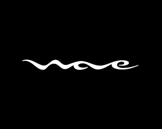
wave
by janzabransky • Uploaded: Jan. 16 '09 - Gallerized: Nov. '09
Description:
Logo design for media communication agency.
As seen on:
My site
Status:
Client work
Viewed:
31451
Share:





Lets Discuss
Very nice and fluid. 'E' seems to be notched up a bit though, no ?
ReplyNnniiiice
Replyperfect
ReplyThank you all
ReplyThis is great.
Replygreat movement, at first glance I read 'move' tho
ReplyLike everyone else said, great movement. But the E does seem off as epsilon said.
Replythis is how i feel right now
Replythank you for tips, I would try to fix it ...
Replygreat job..
Replythe flow is amazing!
ReplyVery nice logo!
ReplyThank you guys.
Replyi like possible duality of WAVE and MOVE.*nice flow.*
ReplyThis is gorgeous.
ReplyThought I floated a long time ago, nice work Jan!
ReplyThank you guys for your positive feedback. I enjoyed working on this logo. Now I made another version of it. The shape stayed exactly same. I only %22used water%22 to draw it. If you like it, feel free to use it as wallpaper.**!http://www.janzabransky.cz/blog/wave-logo-wallpaper.jpg!:http://www.janzabransky.cz/blog/wave-wallpaper.jpg
ReplyJan this is hot! Well done buddy!
ReplyThis looks absolutely gorgeous...
ReplyVery cool, Jan.
ReplyJantastic!
Reply%5Eha Jan this is awesome. WO knocking some great work out.
ReplyJan, this is some seriously cool work you have done!
Replythats a beauty :)
Replythumbs up jan!
Replyvery nice... love the water
ReplyBeyond perfect !
ReplyLooks awesome
ReplyHoly crap, that's awesome!
ReplyThis is my new background.
ReplyWohoho...Real beauty. Bravo maestro:)
ReplyWe want a tutorial Jan.PLEASE %3B)
ReplyThis is my guess: Place logo in photoshop. Find array of water stocks. Warp shots to fit within type shapes. Mask and clone where necessary. Desaturate image.**Overall a fun effect and done well. Kudos!
Replylove this looks great on my background...
ReplyIt was awesome to start, but the water effect just put it over the top. Simply amazing.
ReplyVery nice one. The liquid fluid goes so well.
Replygood, good one.
Replynice
ReplyThank you my friends for such a positive feedback, its so lively, really appreciate it. I am so happy to see two of my logos in gallery among such a great other jobs there. Its like huge inspirational, motivational and educational injection into my everyday working process for clients.**And David - Nate/Thrasher317 is very right, he answered exactly your question how it was made. Its just Photoshop usage of warp function some treatments to details like water drops to gain real look of flow and splashes ...*
ReplyWay to make a splash man!
ReplyYou are sick Jan, wish I've done it, great work!
Replyman what a bonus with the wall paper! you are a legend mate
ReplyFor a surf wear company it will be really great. :)
ReplyAbsolutely lovely. %3C3
ReplyAlright I just changed my wallpaper. How much do I owe?
ReplyHere's a similar tutorial on the water wallpaper effect. Your wave looks gorgeous!**Link:*http://abduzeedo.com/incredibly-realistic-water-text-cinema-4d-and-photoshop
ReplyJan, it's great. with that wallpaper - killer combination
ReplyCool concept! I did something like this in %22one of my logos%22:http://logopond.com/gallery/detail/34149 I wrote the name of a beach as a wave, though! :)
ReplyNice work Saawan, I like Your logo, and You are right about %22marina%22 style of writing. BTW my handwriting looks very similar, too. Thanky You all for comments and floats, I wish You all the best my friends.
Replyvery nice logo - to bad i didnt have that idea when i was doing some work for http://www.wavexercise.com/index.html
ReplyThanks Logocrave, it would be perfect for that kind of products.
Replynice work )
ReplyLiquid work )) very nice )
ReplyHello, janzabransky I really like what you did on this logo by using Black %26 White Then make it with water effect That was really nice.%0D*%0D*Is this effect PS or 3dsmax ? I think you used both of them, right %3Bp%0D*Btw I used your Logo as Wallpaper :D
ReplyThank You very much Mubarak, its just PS, no 3D ...
Replythats so good
ReplySo frikkin nice
ReplyLooks like I never hit this one either... I've always dug this guy! Great stuff Jan!
Replybeautiful flow!
Reply@Beto @Jaggu @Michael @Matt - thanks a lot
Replyyes ... this really is special !!
ReplyPlease login/signup to make a comment, registration is easy