The Fireplace Depot
by Logomotive • Uploaded: Jan. 14 '09 - Gallerized: Jan. '09

Description:
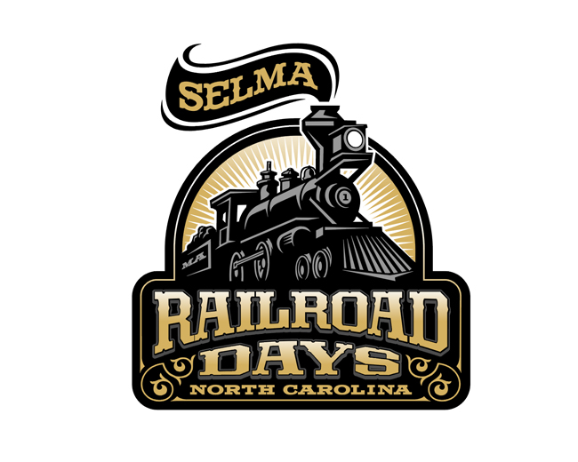
One of my older logos done for a company that sells and installs Fireplaces.
As seen on:
http://www.letterheadfonts.com/gallery/thumbnails.
Status:
Nothing set
Viewed:
31482
Share:


Lets Discuss
Lovely stuff Mike.
Replyfantastic stuff mike, very very nice - i love the font you chose as well
Replythis is great!*
ReplyI remember it well. The cow catcher is a novel touch!
ReplyReally really incredible, love the colors!
ReplyReally well done Mike! I so jealous of good illoers.
ReplyThanks guys!*Roy, good observation. I wanted that part to convey the fireplace grate aspect and direct the viewer back to the name. Glad that some can appreciate illustrative logos too. :-) *
ReplySorry Fabien, and thanks musta posted at the same time :-)
ReplyJust brilliant!
ReplyI am in love with the type.
ReplyThere are some things on this planet that i care: love, people, smoking weed oh...and creativity. Absolutely love it!
ReplyMike, sometimes i feel it is really not fair that you are allowed to post your work here among us minions and make us constantly miserable... David, have you ever considered a separate tab before or after 'view all' and make it 'view ME work here'? phhh....
ReplyEven your older logos are good. Can you upload some of your logos when you were 5, I want to see where you started getting better.
ReplyLOL at logoholik and cerise! I couldn't agree more. :-P Nice job, Mike-E!!
ReplyOK, I'm gonna have to stand up and say it. Mike, you need to loose the duck and replace your logo with this locomotive.***snuggles**- Raja
ReplyWhy does the fire place depot show a train for a showcase of their identity. I think the type alone stands out but the mark is a mixed success with this illustration being a train choo choo engine. I mean lets face it your selling fireplace's why not be more literal.
ReplyThe old engines ran via flame and a depot refers to trains... a little stretch bet it sets them a part to be sure.
ReplyVERY interesting comments guys:-) Thanks and yeah and pretty much what Logoboom said.
ReplyThis is kick @ss!
ReplyMan, I just might agree with Raja. This would be a really cool image for Logomotive. There's even the letters 'L' and 'M' in the illustration. The M is a little more apparent and could even stand for Mike.
Reply%5E Thanks koodoz.*Raja and OC not sure if my clients would relish that idear :-) They have it all over their vehicles and such.
ReplyThis looks so cool %5E%5E
Replylove it!!
ReplyYeah, that's true. Probably not a good idea. Geez, Raja...thanks for making me look like an idiot. :-P
Replylol raja's right ... the duck's gotta go...
Reply%5E wow, I've heard soooo.. many comments on my duck, yet have not heard much on any others personal logos negative or postive, that it is actually making me rethink even rebranding. I mean Like I said before people remember the duk be it right or wrong and make a point to comment about it. Humm...? somehow it must stay within my scheme of things ME thinks.I see all your points but don't forget ducky was around before many of you even started logo design.
ReplySOME will understand my perspective and even agree, most of you will not.
ReplyDon't listen to them. The Duck rules!
Replypoint taken yoda :P
ReplyNo.
ReplyI don't get it, does the company sells trains?...
Reply%5EYou seem to have missed all of the visual puns in this logo.
ReplyYes they sell trains and burn them.
ReplyGoogle it :) I do not claim the actual one in use, it's been manipulated, this is was my final suggestion.
ReplyI think someone recieved some inspiration from you, fourth logo*http://cresk.eu/folio/recent/
ReplyThanks Jerron, I think you could be right.
Reply@Cresk be curious to know your answer to this?
Replysorry about the double post.
ReplyReally enjoy your illustrated logos, Mike.
Reply%5EYou'd have to be Stevie Wonder not to.
ReplyThanks Simon.*@ atomicvibe http://www.youtube.com/watch?v%3D1bGOgY1CmiU
Reply%5ELOL. Stevie's all about calling people up to tell them that he loves them. But actions speak louder than words, Stevie :/
Reply%5E Stevie's gotta call them up. He's done with blind dates.
Reply%5ELOL. I don't think we're reaching Higher Ground with this line of comments.
Replysteam !
ReplyPERFECT
ReplyAh, my second favorite logo on the pond.
ReplyThank you guys.Sorry for the late response back.
ReplyAre the people using this logo? Did you sell it to them?
ReplyYes and Yes
ReplyLogomotive how much was that logo?
ReplyWell I keep my prices private. I'm reasonable. Shoot me an email.
ReplyPlease login/signup to make a comment, registration is easy