Vivia
by rogeroddone • Uploaded: Jan. 11 '09 - Gallerized: Jan. '09

Float
(Floaters:
38 )
Description:
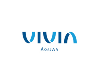
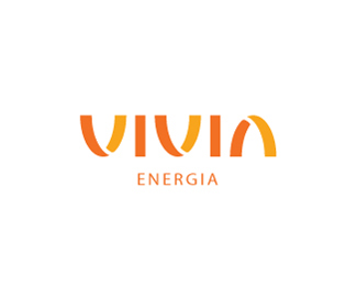
DESCRIPION: Vivia - Sanitation and waste company /// YEAR:2006 /// PROPOSED CONCEPT:
Renovation and continuity were the key words when creating the visual
identity for this company in the sanitation and waste segments /// WORKING FOR: Seragini Design /// SEE MORE AT: www.rogeroddone.com.br
Status:
Unused proposal
Viewed:
23492
Share:


Lets Discuss
nice type work!
ReplyVery well done
ReplyThanks for the comments!
Replyreally nice concept regeroddone! I was wondering, for a greater sense of continuity, how would it look if all the letters were touching?
ReplyGreat logo
ReplyIt reminded me of the Vivent logo%0D*%0D*http://www.vivent.nl/%0D*http://cms.vivent.nl/comodo/upload/cm1020817.pdf
ReplyYes, indeed. This brand has the same constructive basis, what coincidence! *
ReplyIt is unique, and it stands on it's own but it's tough to know its waste management but rather it shouts %22 Vivia : Eco Friendly %22 that being said its not too far off. Great stuff, but it might need a descriptor.
ReplyReally clean design. Good image for a sanitation company to project!
ReplyJust noticed yesterday that it has a slight resemblance to %22Vancity logo%22:https://www.vancity.com/DynamicContent/Resources/Images/vancity.gif.
ReplyYes indeed. The word begins with a V.
ReplyEpsilon, I can't see that...
ReplyVancity is one of the local banks, so I saw its logo many times before I saw the Vivia logo (I like it a lot by the way). And then only when I again saw Vancity again, Vivia logo surfaced in my mind almost immediately. **The treatment of V is quite unique and apparently the similarity is strong enough to create a _one_ way association. Vivia doesn't remind me of the Vancity at all .. go figure.
ReplyWhole VIVIA concept just works so well!
ReplyBeautiful branding!
ReplyPlease login/signup to make a comment, registration is easy