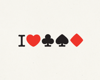
I love poker
by FSD • Uploaded: Jan. 11 '09

Description:
Mark for online poker site.
Status:
Nothing set
Viewed:
8801
Share:


Lets Discuss
great idea:%5D
ReplyI misread it for %22I love Solitaire%22, not Poker :-)**Seriously, great idea. Any reason why you didn't go with the black-red-black-red-black sequence ?
ReplyBecause black-red-black-red is not good visually. And because the diamond have another shape%3B not as other.%0D*%0D*And thank you :)
Replynice
Replycooool
ReplyThanks
ReplyNice serif treatment on the icons.
ReplyYeah, thanks :)
ReplyI'm pretty sure I saw this (or similar) on a t-Shirt at an Atlantic City poker tournament in Feb. 2009
ReplyIts just amazing. I love it :)
Replythis is great, love the mark
ReplyPlease login/signup to make a comment, registration is easy