Shift _ Draft 3
by madebyshift • Uploaded: Jan. 10 '09 - Gallerized: Jan. '09

Float
(Floaters:
69 )
Description:
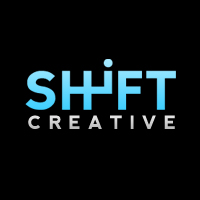
Cleaned it up in Illustrator and fixed some of the letter spacing issues. Trimmed the F & T and tried to keep the letters the same width. Kinda hard with the H - I combo…
Edit: Fixed F&T kerning issues and changed background.
Status:
Nothing set
Viewed:
28063
Share:

Lets Discuss
IMO the space between the %22i%22 and %22F%22 is still a bit wider compared to the rest. Other than that, I wouldn't change a thing:) Nice one!
ReplyVery nicely done man, the kerning needs a bit of work but other than that, it's a great logotype!
Reply%5Ei agree about the spacing--looks like you just have to shift the 'i' to the right (then the space between the 'H' and 'i' would match the spacing between the vertical strokes of the 'H').*nice logotype!
ReplyI liked it before but I just realized this baby is on %22*Fifth gear*%22, I really love it now. Great work man!
ReplyGreat concept.
ReplyAgree with Nex but the concept here deserves a %22fave%22 from me.
ReplyYeah it's one of those great logos, just need to be presented more simple, no gradient BG, move the F closer to the i and I would even weld the F to the T and losing the odd negative space there, but now that's just nit picken. Great logo.
ReplyI agree with *mike* (logomotive), and I was thinking that this logotype might even benefit from a plain, light background and silver for the type!**Of course this would only be to help present it better, 'cause this logo is just gonna be hard to beat!**The letter %22H%22 is so versatile and easy to work with isn't it?
ReplyFantastic concept, Jordan.
Replyyeah i would get rid of that background and make it smaller in general, but great logo all the way
ReplyThanks for the advice and comments, everyone!
ReplyThis reminds me of a campaign RENAULT had for their CLIO model few years ago...
Replysuperb concept
ReplyReally nice design %26 concept.
Replysuper cool concept..
ReplyA lovely idea. Haven't seen this before, well done mate.
ReplyOnce again, thanks for all the comments, guys!**I've uploaded a new version (overwriting the old) that fixed the kerning issues and gave it a plain black background.**@Type08: Do you think you could find a link or something? I'm in the States and have never seen a Renault, but would love to see their take on this.**@Logomotie: I tried welding the F %26 T together, but I lost a lot of readability. On a glance, it spelled out a less-than-nice word. :)*
Replyfantastic concept!
Replyjust great!
ReplyShift LOL! hear ya.
ReplyFantastic concept!
Replyfifth gear logo
ReplyWICKED! floated.
Replywell done, mate! :)
Replythis one is pure class! well thought out
ReplyWonderful idea! But colours should be change for better. I hope that i explained my idea.
ReplyMaybe some gradient or metal effect. %3D)
Replysimple and yet effective :)
ReplyThis reminded me immediately of the Nissan car ad's on TV here in New Zealand. May be something to do with their slogan having the word Shift in it.. very well done i thought :) color could be different but extremely effective showing its audience intent. //cheer!*
ReplyRare case of perfect logo... use it well!*Congrats man.
ReplyYour logo has been stolen!: http://www.jumpzdesign.altervista.org/index.php?Portfolio
ReplyWow, it sure has. He didn't even try to pass it off as his own, he just slapped it on his portfolio as is!**Thanks for posting, spore!
ReplyIt's not the first time that Jumpz has nabbed logos of the Pond...
ReplyGreat logo btw : )
ReplyPlease login/signup to make a comment, registration is easy