Adams apple
by strizhart • Uploaded: Jan. 07 '09 - Gallerized: Jan. '09
Description:
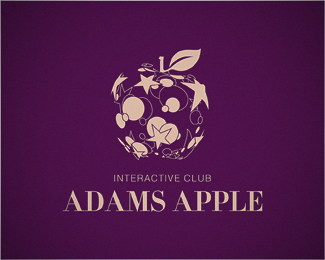
This club is supposed to be a night club actually. "Interactive" just because of kind of new system of guests registration. They can vote for their favorite star. Work in progress
Status:
Client work
Viewed:
18203
Share:






Lets Discuss
Love the color treatment. The illustration and everything is very cool, but how does it relate to an interactive club?
Replythis is dreamy :)***CHEERS
Reply**TheArtistT** this club is supposed to be a night club actually. %22Interactive%22 just because of kind of new system of guests regestration. They can vote for their favorite star.
ReplyVery cool. But I almost want to see more solid stars/shapes to help fill in the gaps a little. I think the apple shape is almost too open right now and needs more shapes to help define it more. Fav'd anyway.
Replyvery nice, very suggestive, great art direction
Reply**sdijock** Thanks for advice***mister jones** Thanks (-%3B
Replynice play and neat execution.
Replygreat inspiration
ReplyI like your idea, and your execution of smaller shapes to make the apple shape is very unique. Stay away from thin lines, however, as they will get severely diminished (and possibly not even reproduced) if the logo is printed or displayed small. I would also experiment with other typefaces for the main text as well%3B I didn't really get the feeling that this was for a night club. You are off to a very good start, and have a very good concept. Keep it up!
Replywonderful job! favorite one! in order to reveal the stars more, the circles can be made 50%25 transparent. after that, at the same time, it will be more 3D.
ReplyХCEрCEший CBCEгCEтиCF
Replynice logo
ReplyThanks man!
Replyvery unique. i like the colors a whole lot!
Replywow amazing stuff!**
Replywow it's 2d but it looks 3d o.O i love this logo, it's so creative :D
ReplyGreat solved. congrats!
Reply%5EWhat's with the links, dude? Nice comments but the soliciting is uncool.
ReplyNice one!!!
ReplyPlease login/signup to make a comment, registration is easy