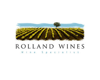
Rolland Wines
by ideoma • Uploaded: Jan. 06 '09 - Gallerized: Oct. '09
Description:
Wine related logo, an original solution because of its painting like features, a bit of complexity in the overall simplicity.
As seen on:
http://www.logotipo.pt
Status:
Client work
Viewed:
22621
Share:



Lets Discuss
Although I'm not an advocate of design competitions you still did a nice job.
ReplyLovely!*
Replyi couldn't make something like that - like it
Replyserene! custom type?
ReplyGreat!*
Replywow yeah i really love this. Stood out.
ReplyBeautiful logo! %3D)
Replyone of the best!
Replygreat, and it has the appropriate feeling!
Replyreally like this
ReplyNice feel to it. Nice job.
ReplyWhat a fantastic illustration. Beautiful work.
ReplyI agree with Chad.
ReplyHow can anyone disagree with Chad?
ReplyI agree again.
ReplyOutstanding.
ReplyThis is really something.
Replyabout time :)
Replycongrat, Love the illo and type,
ReplyDemanding, clear work!
Replywow. now this is LP gallery quality.
ReplyDavid, can you put in a section so I can float this twice? Thanks!
ReplyBeautiful illustration. *I agree with demiphonic that the small type is difficult to read though, but that's easily resolved.
ReplyBeatiful work!
ReplyBeautiful work!
Replyoriginal and beautifull..outstanding work
ReplyClassy distinctive visually pleasing piece with subtle oak palate qualities
ReplyGorgeous!
ReplyI love it!*Great work seriously
ReplyI like it, it's very pretty.*But it doesn't work. At the best case, you need at least 4 colors to print it.*The lower typo is pretty small, i can't read it.
Reply%5EYes it does work. Go take a look at some wine bottles. 4 color is the new 2 color.
Replylike it a lot,*incredible and simple illustration.*
Replylogomotive said:**%5EYes it does work. Go take a look at some wine bottles. 4 color is the new 2 color.**agree, time change and somethings have to change, would be a stupid thing to limit this incredible job cause it need 2 color work.**
ReplyGreat illustration - i love it %3B)
Replyi just want to start a winery so i can use this :)
Reply%5E I propose a joint venture.
ReplyVery well done, but doesn't ROLLA need a bit of kerning work ?
ReplyNice illustration work.
Replynice!
Replythank's for all the comments, this is not a typical work in our studio we tend to keep the grafhics simple but the client pushed us to this kind of illustration and worked fine. yeah the ROLLA could have some retouch, thanks for noticing it %3Dp
Replyperfect logo wine!! thats really beauty and elegant
ReplyGreat !
Replyok everybody said it, but amazing
Replythanx everybody for your nice words and critics, it's gratifying to see our work inspiring creative minds. %3D)
ReplyI'm sorry, I love this logo- but I was browsing your gallery and I didn't really see any more artistic work of this caliber. (No offense) I know a lot of great illustrators (Like Mike and Oronoz, just to name two out of the many, many more) that also rely on minimalism and simplicity, but they never fully reject their artistic talent. You said the client %22pushed you,%22 to it, but this is incredible. I don't see how you could ever put a talent like this on the back-burner.**Like I said, there's probably a very simple answer, but it was bugging me. Toodles!
ReplyIf I didn't make that clear- I was wondering why this piece is the only one of its kind in your showcase. It seems a little out of place.
ReplyChad this was a very particular work, our company is currently working with avery different type of clients and our showcase is currently very restricted by what clients want, it's very hard to sell this type of illustration to our target costumer. we believe every work is worth trying, so we take all challenges hence the loneliness of this logo amongst the showcase! we try to make it simple, clever, legible and adapted to the costumer. hope that you got your answer maybe one of this days we can create something this expressive again! %3D)
Replyperfect
ReplySo much detail but I like it, nicely done.
ReplyPlease login/signup to make a comment, registration is easy