LogoReview
by brandclay • Uploaded: Jan. 05 '09 - Gallerized: Jan. '09

Float
(Floaters:
77 )
Description:
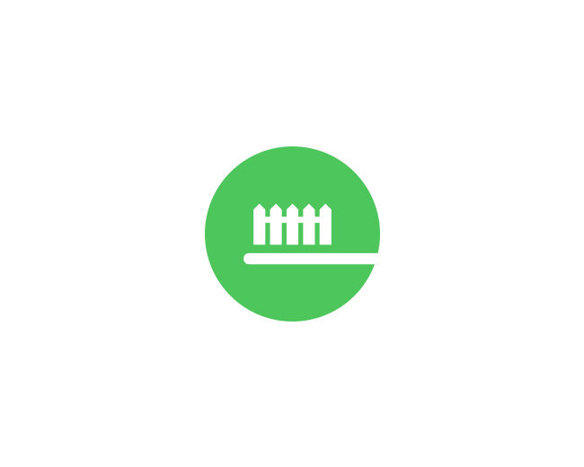
Logo design done for Logo Review; an online community for logo feedback.
As seen on:
Brandclay
Status:
Client work
Viewed:
16,433
Tags:
constructive
•
feedback
•
comment
•
done
Share:


Lets Discuss
nice, simple and obvious - i like %3B)
ReplyGreat logo. I know you've kept the space open to the left of the check mark because that's the space that the complete %22V%22 would have taken up. However, the hole it's creating is a little visually disruptive to the flow of the logo. Nice regardless.
ReplyHmm, I kind of think the 'V' is where it should be. The negative space there helps reinforce the idea that the check mark was formed by the V. If the V is moved closer, legibility could be sacrificed. You have a point though, Steve (sdijock).
ReplyI personally prefer the updated kerning, but I think it's an incredible logo either way.
Replyi think it's great penflare, wouldn't change a thing on this version.
ReplyKerning between E and V is too tight. Also Logo type looks thinner than Review part, not sure if it's intentional.**Very nice otherwise. Simple is the best.
ReplyI don't know what it is about this one, but I really enjoy it.
Replyi kerned it that way so the spacing would be the same from where the %22check%22 is cut off next to the %22e%22 to the top of the %22check%22 by the %22i%22
Replyand its all the same weight
ReplyI figured it must've been the same weight. Typically the dark-on-light type needs more weight to look the same as light-on-dark version. I just wasn't sure if you _wanted_ Logo to look thinner.**Re: kerning, I'd try pushing the checkmark to the right halfway to V's original position. It does look a bit cluttered to me right now, and I can see how the original kerning could've been too generous.
ReplyVery nice logo Sean!
Replythanks everyone
Replypenflare , you definately should stop doing this.
Replyme like
Replyvery cool
Replysimply effective
Replynice and to the point, cheers!
ReplyVery cool Sean!
ReplyI would add a few volume. But in general it is good
ReplySimply great!
Replyvery nice idea, clever and clean %3B-)
ReplyLooking good, Sean. Nice color update too.
Replythanks everyone. client loved it
ReplyHey Sean, thats awesome. VERY NICE. :)
ReplyNice and simple.
ReplyVery nice, clean and simple. Happy the client loved it :)
Replyperfect!
Replylightweight at it's best :)
Replywonderful work!
ReplyWonderful!
ReplyI made a similar logo with the check mark V a few years back...*but none the less this looks superb!
ReplyThis is a very cool and clean idea!
Replyone of the best simplistic logos with a smart twist.*
Replylove the review font
ReplyPlease login/signup to make a comment, registration is easy