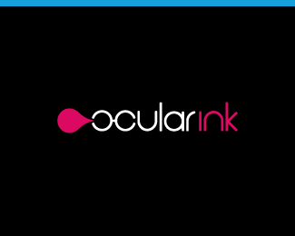
Ocular Ink Trademark
by OcularInk • Uploaded: Nov. 16 '06

Float
(Floaters:
50 )
Description:
My trademark.
As seen on:
Ocular Ink
Status:
Client work
Viewed:
15327
Share:


Lets Discuss
love to hear your thoughts behind it..looks great
ReplyThanks, Contra!! By the way, love your brand name and your showcase!!**My thoughts:**If you refer to the whole logo, you may notice that the O and C in the wordmark represent glasses. This ties in with the name 'ocular' and also represents me. I wear glasses on a daily basis. I always wanted to wear contacts, but my eyes couldn't handle them. So, in the logo, I embrace my glasses. The droplet represents 'ink'. Also, when the trademark is displayed rotated 90 degrees counter clockwise (like it is here), it looks like the ink is dripping for an added effect and depth.**Hope that all makes sense. Thanks again!
ReplyRotate it back 90 degrees clockwise %26 it is a pair of handcuffs blowing bubblegum... only kidding! :P**Great logo!!**
ReplyLOL!! Exactly what I was going for. :-P
Replythanks man for the kind words and the explanation ..love the logo!
ReplyNice work. Just that I would have switched O and C, because this way%60ve you opend the shape of the o, which naturally comes with the c.. %3B ) Still, really like it.
Reply@ contrabrand : Anytime. Cheers!!**@ FUTY : Thx!! Interesting thoughts.
ReplyDoc churns out so many quality logos that it makes his eyes bleed.
Reply@ firebrand : HAHA!! Nice one, dude. And thanks for the kind words. When are you going to post up more stuff? Miss seeing all your fantastic skills at work. :-D
ReplyCheers Kev. Very soon, hopefully... nothing ground breaking tho :)
ReplyThis one could use a star %3BP
ReplyPerhaps two stars. :-P
Replywithout name speaks %22blood from gun%22 for me :) when you call %22ocular ink%22 everything is clear. simple, great.
Reply'blood from gun'... cool name!
Reply@ steem : Thanks!! :-)**@ nido : Indeed...you comment-whore. Oh wait, that's me. :-P
Replyso different view..
ReplyThanks nima and Fahreddin.
ReplyJust amazing! Good work.
ReplyThanks again Julio!
ReplyI feel like the drop is coming in my direction! Nice one!
ReplyIt is! Thanks man!
ReplyGood!
Replyvery distinctive! :)
ReplyI realy like it.*It's no similiar but i remember me a other logo, because the eye and drop. *It is most sale eyewash in Brasil.**ttp://www.minimaxfarma.com.br/images/fotos/fotop_15193_2.jpg**Hugs %5B%5Ds
Replyexcellent color contrast and concept incorporation.**Well Played.
ReplyThanks 2creativo, Andrei, Inventiva, and Werner. Happy New Year!
ReplyAwesome. Your work inspires me!
ReplyThank-you so much!
ReplyPlease login/signup to make a comment, registration is easy