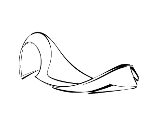
bertha
by kaimere • Uploaded: Jan. 04 '09 - Gallerized: Sep. '10

Float
(Floaters:
38 )
Description:
New website system ... updated ;)
As seen on:
coming soon
Status:
Client work
Viewed:
13177
Share:


Lets Discuss
thanks for your honesty :) kept the type simple in all honesty didnt feel the type should be played with having played with other type options which distracted from the mark - more of KIS in action
ReplyI agree with *Tonfue* and though I know you wanted to keep the type simple, I think because of the color and size it's kind of taking something away from the mark. I may try to reduce the size and darken the color a bit, for better contrast with the mark, which is pretty cool I think!
Replylove it
ReplyThanks Brandon, How are you man ?
ReplyGreat logo.
Replydam u mike! This is brilliant - the only thing I hate is that I am working, well WAS working on almost identical concept for my client (BlueVolt) :(
Replyhit me up on msn
ReplyoLA just saw this will holla at ya later
Replynice work*
Replyawesome. nice feel to this one. great job.
ReplyMe gusta, pero creo que la letra B de Bertha es m%E1s angosta y el conjunto se percibe con falta de armon%EDa.
Replyexcellent, excellent. very modern and appealing.
ReplyGr8 pleasing colors........love it...:)
Replyagree that it's not 100%25 but it's undeniably eye-catching.
Replynice work man lovley**just posted on my blog http://www.csshunt.com/logos/
ReplyMany thanks CSSHUT ....
ReplyPlease login/signup to make a comment, registration is easy