Wine Searcher
by downwithdesign • Uploaded: Dec. 29 '08 - Gallerized: Mar. '09
Description:
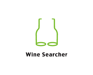
Wine searcher is the worlds largest database of wines. Proposed redesign.
As seen on:
Down With Design
Status:
Unused proposal
Viewed:
24642
Share:



Lets Discuss
smaller i saw eye glasses, but now i see 2 bottles... where is this going?
ReplyI see the profile of 2 bottles. But when I look again I see reading glasses. Nice dual effect :D
ReplyGood Good. Thanks.
Replybottles, eyes, binoculars
ReplyUpdated %3B)
Replyyour mark is really clever itsgareth, is there a version with color? black is such a stark color, quite the contrast from the wine world IMO.
ReplyTop work, Gareth. You're on a roll mate.
ReplyCheers Roy, shall we start and Ingerland chant on the pond? %3B)%0D*%0D*gyui - this logo is at a prelim stage, colour will be added eventually
ReplyOne of your smartest designs yet.
Replygreat concept gareth!
ReplyG, good one! :)
Replynow the typo leaves a bit to be desired IMO. But the mark is spot on.
Replybeer goggles.
Replywine glasses %3B)
Replywell if they don't gop for the %22propsed design%22 you can try another route :-) never heard of wine goggles LOL good one.*
Reply%5Elooks as if I've had 1 too many.
ReplyHaven't we all!
ReplyNice one!
ReplyCheers Robin %26 Dalius, not sure what you meant there D-man but yeah :)
Replywawawewa
ReplyNice work. I get the concept. But for some reason I see a sagging bra every now and then. LOL
ReplyCris: haha whats up bud?%0D*%0D*Bart: That's just wishful thinking %3B)
ReplyCawabunga!!!
Replysay waaaa??
Replynice in a too many sugar lumps kind of way
ReplyIt means Positive, Good, Great, in an aspect greater than 'cool'.*mostly used by headbangers, metalheads, skaters, surfers, and ninja turtles.*Cowabunga dudes!
ReplyI get it now, a la Michaelangelo?!
ReplyCowabunga indeed, very nice
ReplyNice.
ReplyGenious!
ReplyGreat concept and well executed. Nice work!
ReplyI like it!
ReplyI love this...but I am seeing port bottles...hic%3B)
ReplyJust amazing!! Congrats on been featured
Replyi think you can do better than this. i couldn't quite catch the relation between wine and glasses:)
ReplyAwesome!
ReplyClever, indeed.**Missed this back in December. Glad to see it featured.
ReplyThanks! Unfortunately they didnt go with it..
ReplyCongrats also on the 'Logo Of The Month' status on Logo Moose! Bravo!
ReplyClever.
ReplyCongrats !
ReplyThis is great Gareth! Congrats on the feature!
ReplyVery nice, but to me the bottles look like milk ones, more than wine. If they would be a little slimer .... :)
Replyso good. executed perfectly. i got it right away. great job man.
ReplyFantastic..nice job!
Replyamazing logo
ReplyMany thanks for the kind words everyone!
ReplyThis is a very clever concept, well executed.*Excellent!
Replybrilliant!
ReplyIncredible. Very Cool
ReplyLove this!
ReplyIt's very good, smart idea. I see two meenings in drawing, which is very good. Aesthetics, on the other hand, could use more work.
ReplyI love this one -- concept, execution, graphics, everything is fantastic. Nice, nice work Gareth!
ReplyYou designed it? Great!
ReplyAwesome concept!
ReplyAlways liked this one Gareth.
ReplyCheers**@fauzone yes I designed it :)
ReplyReally clever! I'm glad you designed it. %3B-)
ReplyCheers Simon :)
ReplyI saw this one in your book which incidentally compelled me to create a logo pond account - this is visual communication at it's best. Well done.
ReplyWow- great idea!
ReplyThanks Dan, and I'm glad to hear that you joined :)
ReplySimple & effective.
ReplySMART!
ReplyThanks Shinobi, haven't looked at this for a while :)
ReplyWow, Great concept
ReplyThis is genious! like it
ReplyPlease login/signup to make a comment, registration is easy