Trust v2
by Logomotive • Uploaded: Dec. 27 '08
Description:
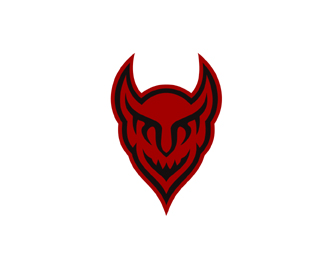
TRUST logo. This is the complete opposite message to this previous design http://logopond.com/gallery/detail/48624 The letters are mirrored or somewhat of an ambigram so a little hard to read.
Status:
Nothing set
Viewed:
16192
Share:


Lets Discuss
I can read it no problem. I want this on my arm to complete my tattoo sleeve:) This one is definitely hot!
ReplyThanks Patrik, glad to hear it's legible. Go ahead and tattoo away:)
ReplyThis one appeals to me more than the heavenly one %7D%3B%7E
ReplyThanks Roy, me too, what's that say about us?
ReplyNice devil and trust combo
Replynice logo mike
Replythis is wicked! :)
Reply%5E%5E%5E Thanks!
ReplyYou little devil.
Reply%5E Oh yeah, I've got a nasty side to me :-)
ReplyFierce!!
Replyur a machine man!
Reply%5E%5E Thanks, the devil made me do it.
ReplyAh yes, but POSSESSION is 9/10ths of the law.
Reply%5E%5EThe irony in those statements.
Replylol...
Replyheheee..priceless
Reply%5E%5E yeah I'm the devil sometimes.
ReplyI don't Trust too many these days.
ReplyWow, the type is so abstract, but I was able to read it instantly. Great work as always.
ReplyThanks devey, nice to hear, that others can read it also and not just the designer.
ReplyContrary to most I am more with the other design. Not because of my mentally being, but rather with the fact, that the word is IMHO not present enough here. Its too much around, that suppresses it and rather make it obvious by the devilish symbol, rather than by the word itself. And I found it hardly readable, even if I knew, what I had to look for. My guessing is, that the upper connection line is too fat (killing the letters) and the 'U' is too big (I know, its a nose). Not sure, if could I express myself well, in short: its too hidden - less than subtle.
Reply@ watermark, I can understand that. It was kind of the whole point of it though. How the devil disguises himself.
ReplyPlease login/signup to make a comment, registration is easy