Hong Kong Design Institute
by liquisoft • Uploaded: Nov. 13 '06 - Gallerized: Apr. '08

Float
(Floaters:
22 )
Description:
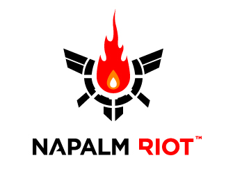
The Hong Kong Design Institute held a pretty sizable competition about a year ago, in which they called for logo entries to represent their new design institute.
There are several levels of symbolism in this icon, so let me explain.
First off, there is the symbol of the blossoming flower. This ties back to Hong Kong\\\\\\\'s flag, and also reflects the nature of the students at the school, blossoming into professionals through their education. The link to Hong Kong\\\\\\\'s flag is also exemplified in the use of Red as a primary hue.
Second, there is the symbol of the flame. This symbolizes passion; the passion for bettering one\\\\\\\'s self, the passion for learning and knowledge, the passion for design. The flame is also exemplified in the slight gradation from red to orange, where orange is the center of the icon.
Thirdly, there is the symbol of the star. Not to be corny, but \\\\\\\"reaching for the stars\\\\\\\" was essentially the point. The star also is representative of fame, renown, and celebrity, reflecting the hopes of the students to achieve greatness. The gradation helps enhance the star, giving it a slight glow.
Sadly I never entered this. I was too preoccupied with my senior thesis and all of my finals.
Status:
Nothing set
Viewed:
17019
Share:


Lets Discuss
This one of the best logos I've seen on this site by far. 10 out of 10! I wish you had entered it into that competition, it would have been an awesome portfolio piece.
ReplyIt's still an awesome portfolio piece. Whether it's in use or not. :-)
Replythat's a lotta symbols
Replyi love it
Replygood jobk dude.
ReplyNice! it matches with Hong Kong's culture, it reminds me of Hong Kong flag.
ReplyPlease login/signup to make a comment, registration is easy