upside down productions
by jsae • Uploaded: Dec. 23 '08 - Gallerized: Dec. '08

Float
(Floaters:
58 )
Description:
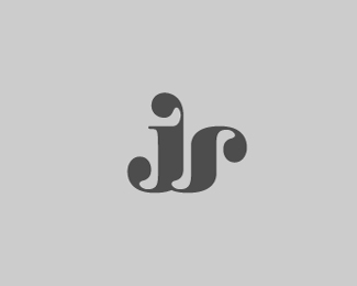
each letterform is either another letter or itself flipped upside down...
(umop episdn)
Status:
Nothing set
Viewed:
45156
Share:
Lets Discuss
Nice! I'd kill the shadow and let the type shine. the %22productions%22 might be a bit small or need bolding IMO.
ReplyHaha .. very clever yet still dead simple to read.**(not sure about the shadow though)
Replythanks joder and epsilon! yeah, i was debating about the shadow...*!http://www.saegusa.com/justin/images/logos/logo_upsidedown_noshadow.jpg!
ReplyThis looks certainly better to me. I would also lose the dot under %22i%22 .. and perhaps see how it looks with a sans serif type. That's just fine tuning though.
ReplyI think it looks great without the shadow
ReplyWord. Very smart idea and look. Maybe show it with a black background? Just a thought.*I like the type face, it pushes home the upsidedown-ness of certain letters.
Replythanks again for the suggestions! i think i like the slabs, tho...*
ReplyVery nice indeed!
ReplyOn black it looks awesome!
ReplyLookin' great bud
Replyi3%3E%7CI7 I
ReplyiOP!N XNVHJL**(and everyone else, too...)
ReplyiOOJL 3W
Reply(: iW37qoJd ON
Replygooood!
ReplyVery creative reuse of similar letters.
Replylove it.
Replythanks, all!
Replyvery nice!
ReplyFantastic!!
ReplyI love when simple meets tricky. Great execution.
ReplyI love this logo, partly for the fact that I always sing Diana Ross when I see it.**Upside down, boy you turn me inside out :P
ReplyWOW!)
ReplyI love it when a logo is simple but very creative. Good job! respect
Replynice balance here between getting the point accross and remaining legible.
Replythanks, everyone--much appreciated!
ReplyCreative design!!
ReplyI like!
ReplyAMAZING artwork!! great stuff..**what's the name of the typeface?
ReplyPlease login/signup to make a comment, registration is easy