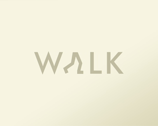
I really like the coloring and the idea. Looks very good. Could the three lines possible look like a M (for movement)? Just a thought. Anyway, good work! :)
@brandcore: it is very similar indeed :) haven't seen it before but the concept is totally different. I like my idea better :) **Thank you all for comments.


Lets Discuss
I really like the coloring and the idea. Looks very good. Could the three lines possible look like a M (for movement)? Just a thought. Anyway, good work! :)
ReplyPerfect color choice ! A great looking logo altogether.
ReplyVery clever. The mark resembles an 'M' already.
ReplyYeah. Really nice!
ReplyFantastic concept!
ReplyI like the design a lot but the colors to me make it look like a military rank chevron.
ReplyThank you all guys :) I really appreciate that
ReplyWidlic, the three lines do look like an M. Great execution on this design.
ReplyLike it!
ReplyLike it very much
Replyexcellent design! love the concept and colors.*have you tried shrinking down the 3 motion lines?
Replylike it
Replynice concept but it is similar with this one *http://www.schmiemann.de/Media/Shop/danish-design-logo.gif
Replyhats off
Reply@brandcore: it is very similar indeed :) haven't seen it before but the concept is totally different. I like my idea better :) **Thank you all for comments.
ReplyThis looks great! Sweet work.
ReplyGreat work! Keep it up :)
ReplyAbsolutelly great piece!
ReplyPlease login/signup to make a comment, registration is easy