TerraMarker
by ArtMachine • Uploaded: Dec. 01 '08 - Gallerized: Mar. '10

Float
(Floaters:
63 )
Description:
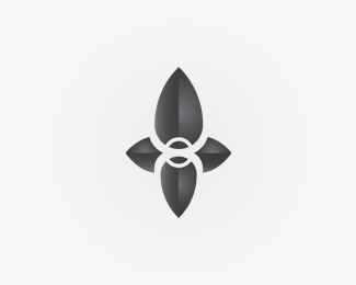
Logo proposal for TerraMarker™, a real-estate data provider. They help people find specific information about property and other geo-targeted sites. Furthermore they provide aerial video and photography.
The symbol was inspired by various tools of navigation: arrow, mouse cursor, sextant, and wind rose.
Status:
Unused proposal
Viewed:
9487
Share:


Lets Discuss
More on %22Behance%22:http://www.behance.net/Gallery/TerraMarkera/153243
ReplyNice logo and presentation, Julian.
ReplyLove it, dude!
Replyvery cool!
ReplyGood job! Very nice!
ReplyClaps for a quality logo. Clap! Clap! Clap!
Reply__Taking a bow__ :)*Joe, do you speak Spanish? If you don't you should look up your nickname. I think it will cause considerable amusement.
Reply%5E That's a mighty long bow MR Big. Nice logo AM
Replyvery nice, love the sharp edges and typeface works perfectly
Replyi love this, is the type 'stainless'?
ReplyThanks Mikey, Sean and Jesse. No, its __Stratum__
Replyvery nice one
ReplyThis looks fantastic.
Reply%5E at least :)
ReplyI'm very thankful for your comments. At least. :)
ReplyThanks a bunch, holmes.
ReplyWell done.
ReplyThank you, meta.
ReplyVery cool mark! %3E Love the Behance presentation!
ReplyThank you very much, Michael. **@Justin: Would be great :)
ReplyCertainly gallery material here :)
Reply%5Ewhat he said %3B)
ReplyThanks a bunch Bojan %26 Niall. :)**Anthony, %22strange%22?
Replywent to comment on this today but boss walked in a threw me a charles manson look... this is absolutely savage. From concept to type to color, the whole lot. love it Art Machine, type positioning is not strange, its bang on the money. alinged perfectly wit the M... perfect juxtaposition.
Reply%5E And mark is pointing to the name. I think it works.
ReplyYeah, me too :)
ReplySlick logo AM, the typeface suits the mark perfectly. **BTW: Am I missing something? How come I see Anthony Lane twice? %22AnthonyLane said%22 %26 %22Absoludicrous said%22 O_o
Replyits taking a while but fully deserves its spot. Good things come to those who wait...
ReplyNice work... well crafted and conceptually logical.
ReplyLove the way that the symbol sits with the type so comfortably and balanced. Nice ideas for the symbols development too.
ReplyBeautiful logo, and I love the type placement!
ReplyAgreed, like the slightly unorthodox 'type above mark' placement. Really works well for this identity.
ReplyReally gorgeous logo mark, love the style.
ReplySelected for the %22Shapes %26 Symbols%22 edition of the LogoLounge Master Library series!
Reply%5ECongrats buddy!
ReplyCan't believe I haven't floated this one, impressive work Julian.
ReplyPlease login/signup to make a comment, registration is easy