LakeTower
by Type08 • Uploaded: Nov. 18 '08 - Gallerized: Nov. '08
Description:
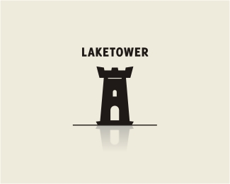
Tower on the lake with the reflection.
Status:
Nothing set
Viewed:
9807
Share:





Lets Discuss
I think the type might be just a bit too light. But, pretty cool effect.
ReplyIt's nice, but I would have given the reflection a slight ripple effect to enforce the %22lake%22 aspect more. And I also agree with LA about the type weight (and size).
Reply@ Lawrence: Thanks, I'll fix it a bit...*@ Sdijock: it's a tower on the lake, not on the sea. Lake waters are usually very calm, as I was thinking this one could work for a hotel or insurance/consulting agency (and want calm there, won't we?)... :) Thanks a lot!
Reply@ Lawrence: Thanks, I'll fix it a bit...*@ Sdijock: it's a tower on the lake, not on the sea. Lake waters are usually very calm, as I was thinking this one could work for a hotel or insurance/consulting agency (and WE want calm there, won't we?)... :) Thanks a lot!
ReplyFixed...
Reply@Type08 - I'm not trying to be argumentative, but I've never personally seen a completely still/calm lake, and I used to live on one growing up. Next time you're on a lake take a good look at a reflection. You'll find that no matter how calm the lake may appear there's always distortions (ie, ripples) in the reflection as the water is constantly in motion - it's called fluid dynamics.**That being said, creative license should prevail in this matter and you should leave the logo as-is.
ReplyIt's all good my man! Didn't mean to argue with you. I just wanted to make it perfectly calm... With a purpose... That's all... I always appreciate your comments!
Replyfor some reason i was imaging a loch ness monster profile next to the tower (you could call it lochtower!). i still like it anyways, but probably more with ripples:P
ReplyThanks, Gyui!
ReplyI think you should add the ripples too. It would give the reflection more purpose. You might even be able to create the ripples without any gradients and make the concept even stronger. Just a thought. Nice work though.
ReplyThanks, Kevin (and the rest of the crew). I'm going to save your ideas for next one with this kind of concept. I really like how this one turned out, there's something about this calmness that I really like here... Thanks guys!
ReplyI see an A
ReplyI think it'd be nice if instead of a straight line you had a line that symbolized water more.
ReplyThe reflection could be a grey lines of varying thickness.
ReplyThank you guys, all great ideas! Thanks a lot!
ReplyNice Work!
ReplyThanks, Karim!
ReplyA solid base line and nil ripple makes the tower look like its on a glossy floor than a lake. An eye catching logo though! :)
ReplyPlease login/signup to make a comment, registration is easy