Education Park
by Karimix • Uploaded: Nov. 16 '08

Float
(Floaters:
6 )
Description:
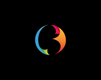
The design of the logo is based on an icon, made out of four similar abstract book shapes. The book embodies education.
The convergence of the books together in the center of the icon represent unity and harmony.
One of the books is detached from the others, which conveys growth and expansion.
The four colors used show variety and diversity...
Status:
Nothing set
Viewed:
10560
Share:


Lets Discuss
Great concept. I like how the book shapes can also evoke birds. I'm wondering if the mark would be better if the green book was flying away. The yellow book flying away is flying backwards. Even so, you've done a nice job.
ReplyGreat logo ya abourizk!
ReplyPlease login/signup to make a comment, registration is easy