Butterfly & Dog
by joDer • Uploaded: Nov. 14 '08
Description:
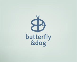
Logo for a boutique soap and skin lotion company. I was determined to avoid the "sameness" in logo renderings similar companies used, so I went graphic. Wanted the concept to play directly off the name which I think is just great.
Status:
Nothing set
Viewed:
4279
Share:


Lets Discuss
I can't really see the dog, and i've been staring at it a long time, but i love what you are trying to do.:)**maybe also adjust the kerning between %26 and dog.
ReplyIt's what i did lol. The dog has an ear, eye, and nose :). Thanks for the note
Replyso it's like a profile of a dog's face?
ReplyYes a really fat dog lol, with floppy ears. Sauage pooch? Took me a LONG time to find the arrow in Fedex.
Replyi like your concept a lot, but i wish the dog was more discernable. i think it is because the eye and nose are exactly the same. have you tried different marks for each?
Replygyui:**I did try a bunch of different dog ear/eye/nose combos, settled on the bigger nose smaller eye. The ear connection limits placement somewhat, and I didn't want to add a different shape to the mix, so I stuck with simple circles. *
ReplyPlease login/signup to make a comment, registration is easy