Goosebumps 2
by jaredm • Uploaded: Nov. 13 '08 - Gallerized: Nov. '08

Float
(Floaters:
21 )
Description:
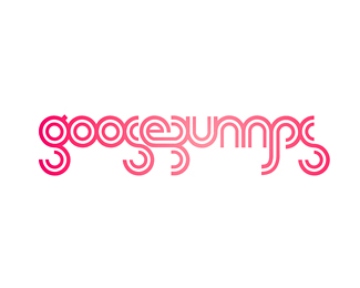
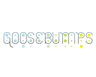
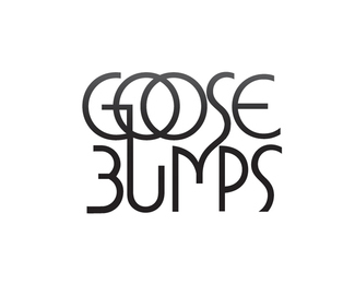
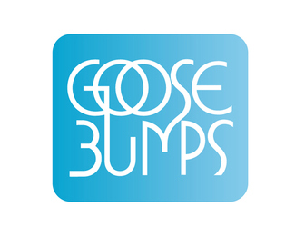
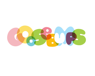
Goosebumps is a consultancy that brings creative agencies and clients together. Through a series of workshops, trust and friendship is developed - a platform for a strong future partnership. "Goosebumps" describes the natural emotion of fear and excitement in starting a new relationship.
As seen on:
Status:
Nothing set
Viewed:
23882
Share:

Lets Discuss
The logotype is nice. Not sure why you needed to include the head.
ReplyMuch better without the head.
ReplyThere are a lot of reasons why I wouldn't think I'd like this...but I do!
ReplyI like the type choice, as well as the gradient treatment.*I'm not so sure about the dots, as they obscure and confuse the text. Standing any further than 2 feet from my screen I begin to lose readability. That said I like the overall direction. Very whimsical.
ReplyTrendy logotype... I like the look of it. Not sure you would want to use it for a design consultancy though... I don't think that the type is transcendent. Don't get me wrong, I like the font (Lemur?) but I just think it is too trendy for something that you will (hopefully) be using for a long time. If that makes any sense...
ReplyThe comments regarding legibility are valid. Note, this was only one variation of this logo, showing it over a dark background. I've uploaded other versions of this same type treatment on a white background as well.**Thanks for the comments.
Replyinovative..
ReplyI think I am out of touch these days. I am not digging this one. I actually do not really get it either. Seems more of a illustration than a logo.
ReplyBit too hard to read. I always think of the Goosebumps books by R.L. Stine and the bumpy embossed text on every cover. Ah those were the days. http://www.scholastic.com/goosebumps/
ReplyBy the by, that was me reminising, not comparing your logo to his.
Replylooking good...
Replyyou talking about hindmarshdesign Raja?
ReplyThis logo looks very confusing when you see it from far I think a logo has to be readible clearly from any distance in order for the cient not to be confused.
ReplyPlease login/signup to make a comment, registration is easy