advertisment
2474

Lets Get Loud Cheerleading

by shaneg • Uploaded: Oct. 30 '06
Gallerized Nov. '06 a3aa57b5a7602c9dabd56b0f1c2c798f.png
8001

Description: 
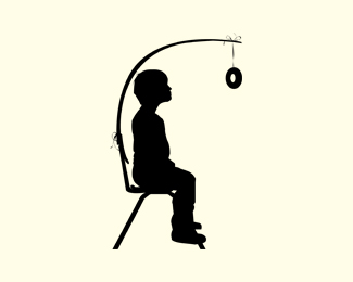
Concept for a logo design for a cheerleading school.

Status: Nothing set

Commenting: Not seeking critique, comments fine

Tags: shanedancegirlcheerleadingcheerleader

More from this user:

OcularInk said on Nov. 02 '06

I think this would be more effective if the opening on the megaphone was facing the viewer...as if she is screaming (getting loud) at you. -Kevin

pritchett.nick said on Nov. 10 '06

i don't think that would work...if you had a front view i dont' think you would be able to tell it was a megaphone.

oddlaa said on Nov. 11 '06

Wow, that's kind of creepy. Reminds me of the Barbie legs in Toy Story that had the fishing hook thing attached. I don't know if it's as dynamic as it should be for such a dynamic name as "Let's Get Loud!"

toure said on Nov. 13 '06

Putting objects in the place of human heads works better with slightly more abstracted, cartoonish art. When you use realistic line work like this, it does kinda get that creepy, mutant-barbie look.

dougspain said on Nov. 13 '06

I liked this. It grabbed my attention but I have to agree with toure, it's a little creepy as it is. Maybe if you over exagerated some of the elements like making the megaphone and pom pons bigger.

denika said on Nov. 15 '06

I agree with toure. This may work better with a less realistically proportioned body.

madrid said on Nov. 21 '06

This logo flat out sucks as a logo.

shaneg said on Nov. 21 '06

Thank you for your comments "madrid"

shaneg said on Nov. 21 '06

only problem is when I commented on your "logo" I actually gave you reasons WHY I didn't feel it was a solid logo.

dhck said on Nov. 22 '06

this is fun :D

lifesaverservant said on Mar. 18 '08

I love the concept. Unlike the other posters which I respect their opinion. I don't think it's that creepy. I like it. I've done quite a few youth events and youth event logos (yet to be posted) and man the things that work the most as far as keeping their attention is the shock factor of difference. That is the main reason for why I like it. Good job, I'd buy it.

shaneg said on Apr. 15 '08

@LIFESERVANT: That's exactly why I did it. They told me they wanted a logo that they could stick on a shirt and it would grab peoples attention and look "cool" They were too scared to use it though...

lifesaverservant said on Apr. 15 '08

typical... ;)

nido said on Aug. 29 '09

this imo is absolutely brilliant!... well done to you shaneg on a fantastic bit of work...

Type and Signs said on Oct. 09 '11

I like cheerleaders ...

Please login/register to make a comment, registration is easy,

Logopond Book V1 - PreSale Now!