SHDC
by Logomotive • Uploaded: Nov. 09 '08
Description:
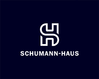
Logo for Schumann-Haus,Digital Consulting. While the D and C are also in the design, this was not planned but worked out nicely in the mark.
Status:
Nothing set
Viewed:
4703
Share:



Lets Discuss
Love it! Nice one again :)
ReplyTimeless.
Replysolid. would u consider a colored version where the c and d are a in a color separate from the rest of the logo? (the horizontal bar connecting the c %26 d would remain white) That way it draws attention to the c/d, since I don't think anyone would notice without you telling them they are there.
ReplyI think this is good as it is. Schuman Haus is obviously the important part. Though I think it would be better if line ends were shaped different than the current diagonals.
Replynice one..
ReplyAs a big fan of yours Log, I gotta admit this one doesn't look good. The merge seems very unnatural to me. It's kinda like some of that logotypes where the client forces you to something you wouldn't do in normal circumstances.
ReplyI could not disagree more. This is classic design that could've been created 100 years ago or 100 years from now (assuming we still use the alphabet and not telepathic chips embedded in our brains). But different opinions are what we're here for after all.
ReplyThanks People.*ha ha Glen thanks and tru dat, no problem Matheus it's quite alright to hve different taste. I actually thought it was sexy myself and I was not forced to design it this way. Only instructions where to design an SH combo in some clever way. This is the design the ended up choosing http://logopond.com/gallery/detail/38719**
ReplyGood idea with perfect construction, I like so much the ambigrams!
ReplyPlease login/signup to make a comment, registration is easy