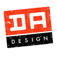
D.A. Design
by Darrel • Uploaded: Oct. 29 '06 - Gallerized: Jul. '07

Float
(Floaters:
26 )
Description:
Working on a logo for my freelance gigs. Trying to go for something simple and bold. The logo is my initials.
Status:
Nothing set
Viewed:
8412
Share:


Lets Discuss
Typophile...that's where I've seen this. This is a very strong personal identity, Darrel. And I agree with logomotive, it would make a great typeface.
Replyvery nice darrel - your work is great%7E
Replylove it .... very nice
ReplyWonderful design, the spacing is superb and your use of bold colours helps the logo stand out. I too would love to see the 'DA' character made into a typeface in its own right! Top Notch!
ReplyI saw it on Typophile too. It looks just great and is very memorable as well.
ReplyI really like this. The fact that both D and A are equally distributed makes this mark even stronger. My only gripe would be the addition of *%22design%22 underneath. But if you're starting out, and yet have to create a presence, it's probably worth it to keep for now.*Well done.
ReplyThis one's for me, isn't it? :)
Replyvery nice
ReplyPlease login/signup to make a comment, registration is easy