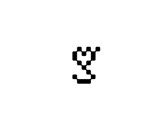
very clever.....very clever. I like it because it was not a immediate read. But the concept was sticky. Then when you do read it, it makes it more clever and sticky. This is a very successful logo
I feel like most people will try to read this as %22LOVE%22 first, which is what I tried to do. Then I tried to read it as anything really and couldn't - had to be coached by the title.
this is cool.. if people are questioning the readability you could flip the %22A%22 so it's an upside down heart.. this way all the letters are capital too.. just a thought. Kudos!
very cool. from a designer's perspective, definitely readable. from the general public's perspective, i'm not so sure. also, what is this concept for anyway? an actual client or just a %22fun%22 concept?
If I tried to read it before knowing what it was suppose to say, it would of taken me a good amount of time to get it. Imo, for the A, it should of been an upside down heart. All the other letters seem to be capital %22PL Y%22, but then the %22a%22 is lowercase. Very creative even though, %22some get it, some don't%22.
I live in Thailand, and so I asked a Thai person who barely reads English to guess, and they said %22play%22 right away. I saw it as well. I'm a business owner who has worked with designers and I enjoy the work displayed here on Logopond.


Lets Discuss
nice concept, but really hard to read,
ReplyNice! I read it straight away. I thought Kliment had already come up with this concept but it is different.
Replyi like it! I didn't have a problem reading it.
ReplyVery nice, I read play straight away!
ReplyThis still looks familiar. hmmm.
Replyi read play immediately and i like it very much!
Replyok ok i get it, am the one with the reading problem :)**congrats mate
ReplyWell done %3E Congrats!
ReplyI'm afraid I couldn't read it either.
ReplyI read it immediately. I think it's great!:)
Replygreat idea, i read it immediately too!
ReplyVery Good!
Replyvery nice, but it is a bit hard to read.
Replyabsolutely amazing, its easy to read, i love it!
ReplyAbsolutely, ridiculously, awesome.
Replythanks guy, i'm glad you like it :)*firebrand - the inspiration for this one comes from kliments logo :)*
Replyvery funny!
ReplyBrilliant. I'm amazed it works.
Replyvery clever.....very clever. I like it because it was not a immediate read. But the concept was sticky. Then when you do read it, it makes it more clever and sticky. This is a very successful logo
Replymonograms always work. I already can see it featured and highly floated in no time.*
Replygreat!
ReplyIt is cute, but using hearts as letters is getting way over used.
Replyvery nice!
Replymy hearts with you lol**love re-use of shapes forming an abstraction of a word**makes me think %22Love to Play%22
ReplyJust spotted this - nicely done.
ReplyI feel like most people will try to read this as %22LOVE%22 first, which is what I tried to do. Then I tried to read it as anything really and couldn't - had to be coached by the title.
Replythis is cool.. if people are questioning the readability you could flip the %22A%22 so it's an upside down heart.. this way all the letters are capital too.. just a thought. Kudos!
Replyvery hard to read @ first glance
Replyvery nice concept...well executed too.
ReplyNice concept. However I must admit...If I had not read the text title on the side, I wouldn't have read it as %22play%22.
ReplyGreat :D
Replyreally cool to look at...but i read it as plav :(
Reply%5Eagree with JohnM.
Replyhttp://www.behance.net/Gallery/PLAY/61789
ReplyAwesome! I was able to read it straight away as well.
ReplyI found it extremely hard to read. Shouldn't the heart for the 'A' be upside down?
ReplyVery nice one, no problem in reading it at all.
ReplyCool.
Replyi saw it straight up! too cool!
ReplyNo problems reading it...great work!!
Reply@_@ excellent concept!!
Replyvery cool. from a designer's perspective, definitely readable. from the general public's perspective, i'm not so sure. also, what is this concept for anyway? an actual client or just a %22fun%22 concept?
ReplyIt's so easy to read you just have to love pbd-something written in hearts.
ReplyBrilliant!
ReplyThank you all :), the logo is a personal concept inspired by Kliments work on play.
Replythat makes everything clear :) great work then!
ReplyOne of the best I've seen in the gallery for a long while. No probs with legibility at my end.
Reply%5E I totally agree.
ReplyIf I tried to read it before knowing what it was suppose to say, it would of taken me a good amount of time to get it. Imo, for the A, it should of been an upside down heart. All the other letters seem to be capital %22PL Y%22, but then the %22a%22 is lowercase. Very creative even though, %22some get it, some don't%22.
ReplyYou copy from a very similar logo (and you know what i%60m talking about). take it , don%60t be fool *
ReplyI love it!
ReplyA little hard to read, but very beautiful. I have love in my hearth!
Replyfirst time i saw it I I thought: wow!! play written with hearts! this is a great concept...I'm definitely in love with it :::
ReplyI live in Thailand, and so I asked a Thai person who barely reads English to guess, and they said %22play%22 right away. I saw it as well. I'm a business owner who has worked with designers and I enjoy the work displayed here on Logopond.
ReplyI love it! nice creative!!!!!
ReplyLove the play!!
Replythank you :), i'm glad you like it.
ReplyBrilliant!
Replyanother one that slipped me by! an instant favourite, perfectly executed
ReplyIncredible !
Replyvery good!
Replyrule
Reply::D
ReplyReally Good but not easy to read it.
Replyread it instantly. love it.
ReplyPlease login/signup to make a comment, registration is easy